Four-Bar Linkage Model in Excel
I created this 4-Bar Linkage Model mainly to experiment with a Data Table for displaying the coupler point path. It also includes a hidden animation feature based on circular references. You are welcome to download the file and play with the model, but disclaimer: I created it fairly quickly and have not done extensive testing.
See below for more details about some of the Excel features used in this model. For more kinematics-related content, see my kinematics page.
The above video was created using Camtasia to do a screen capture of the Excel chart. This animation uses circular references to (1) increment the angle of Link 2 and (2) create a growing array of X-Y points.
4-Bar Linkage Model
in Excel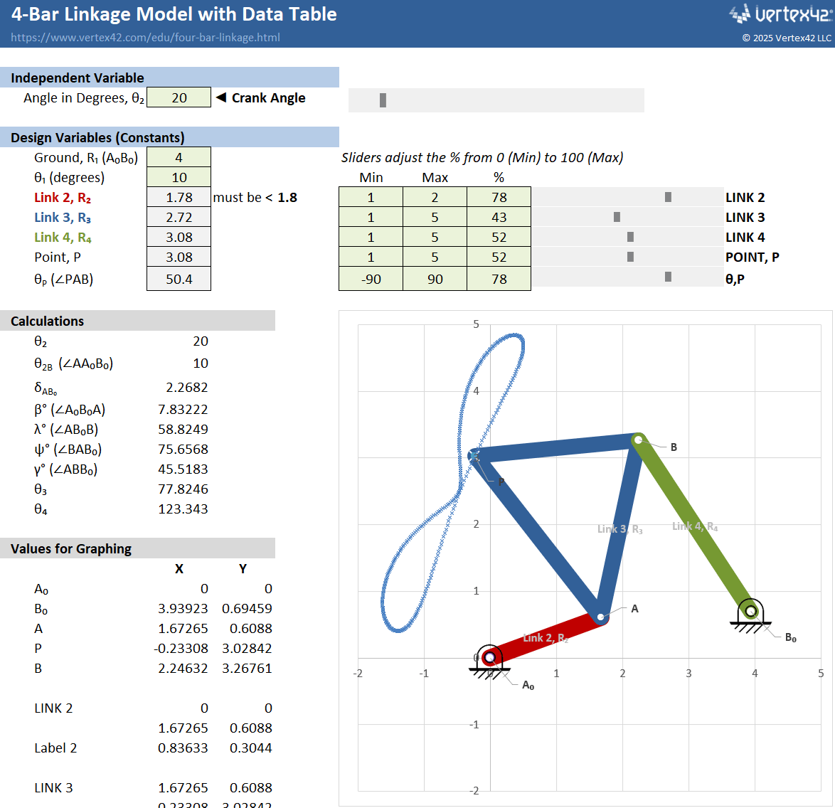
Download
⤓ Excel (.xlsx)License: Private Use (not for distribution or resale)
Description
This model is set up to calculate the positions of the links in a four-bar linkage, but only for a model that allows full Crank (Link 2) rotation. The primary input is the angle of the Crank. You can use the slider bar to adjust the crank rotation.
The secondary inputs are the link lengths and the length and angle between the ground locations.
Slider bars can be used to adjust the link lengths. You can change the Min/Max values for the link lengths, and the slider bars are set up to adjust the % (between 0 and 100) linearly where 0% is the Min value and 100% is the Max value.
Data Table
A Data Table has been set up which runs the model for all crank angles 0 to 360 in 1-degree increments. That is how the coupler path is calculated and shown in the graph.
Data Tables are awesome tools for modeling in Excel, so I'd highly recommend learning how to make use of them if you build models and simulations using Excel.
Chart Techniques
This template is also an example of some interesting things you can do with customized Scatter Plots. The link labels are created by adding custom Data Labels to specific points on the chart. The links themselves are simply very wide-stroke lines connecting the beginning and end points.
Each link is added as a separate 2-point data series, so that the lines can be made a different color. The pivot point is just a circle-shaped Marker.
The ground symbol for points Ao and Bo was created as a separate png image and then used as the Image Fill for the chart series Marker.
Square, Uniform Grid Spacing (ΔX=ΔY)
To make a perfect circle or square with an Excel scatter chart requires a bit of manual work. There is no automated built-in option to set the X and Y axes in a scatter chart to be exactly the same grid spacing (though a VBA macro can help).
The method that I use is to create a square as a shape object and then overlay that square on the chart's gridlines and then adjust the width and height of the chart object until the gridlines are really close to square.
Animation Using Circular References
I've hidden the rows in this file that control the animation of the chart because the animation doesn't work if you are also using the Data Table (the Data Table would need to be deleted first).
To create an animation, you first need to Enable Iterative Calculations with Max Iterations = 1 by going to File > Options > Formulas. Unhide the hidden rows, check the Start box, and press/hold F9 to force recalculation of the spreadsheet (which iterates by 1 each press).
References and Resources
The equations I used for this model came from an old set of notes I used in my kinematics class from BYU. See my kinematics page for some of my oldest Excel stuff on my website.