Create a Dot Plot in Excel
A Dot Plot or Dot Chart is one of the most simple types of plots and they are very easy to create in Excel without having to use a Chart object. The trick is to use the REPT() function to display the dot plot either horizontally or vertically. I will explain how this is done and you can download the Dot Plot Example file to see how I created the dot plots on this page.
 Download the Example Dot Plot (dot-plot.xls)
Horizontal Dot Plot
I like board games. The example dot plot below shows the number of times out of 50 that I rolled a 1-6 with a single die. Actually I cheated because these values were randomly generated in Excel (see the example file). But it demonstrates the point.
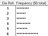
Fig 1. A Horizontal Dot Plot
A horizontal dot plot is probably the easiest type to create. Just list the category labels in column A. Then in column B enter the corresponding numbers. To create the dots for the dot chart in column C enter the formula =REPT("•",B1) or =REPT(CHAR(149),B1) and then copy the formula down. Then, hide column B. Pretty simple, eh?
Vertical Dot Plot
One of the games I like to play is Settlers of Catan. If you're familiar with this game, you may recognize why I used the following example vertical dot plot.
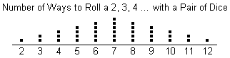
Fig 2. A Vertical Dot Plot
The trick to creating a vertical dot plot is to simply change the orientation of the text within the cells to vertical. Otherwise, the procedure is pretty much the same as the horizontal dot plot.
Spice up the Dot Plot
When you use this approach to create dot plots, you can change the color of the dot chart by just changing the font color. In the example below, I've used conditional formatting in Excel to automatically make the maximum value red.
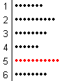
Fig 3. Using conditional formatting to highlight the Max
Tip: If you want a larger dot without increasing the font size, you can use the WingDing font and the letter l (el) for the repeated character.
Warning: Make sure you use the same characters and fonts for all the dots or you could end up misrepresenting your data by making one set of dots larger, and therefore longer, than the others.
Use Other Unicode Characters for Dot Plots
Although dots are what give this type of chart its name, you can create in-cell charts using REPT() with many other types of characters.
See my article about Unicode Characters in Excel.
Here a few of the characters that can be used to make dot plots more interesting:
█ ★ ☆ ❤ ⚑ ⚐ 🙂
To use one of these characters, you can just copy and paste it from the browser. See the section in the article about creating pictographs and data bars.
Other Charts and Plots for Statistics
- Pareto Chart - This template helps you perform a pareto analysis to analyze most significant factors.
- Control Chart - Create an X-bar, R or S Chart for process control.
- Box and Whisker Plot - Create a box plot in Excel for multiple data sets.
References
- Dot Plot Utility at Peltiertech.com - Shows both the in-cell approach and how to create dot plots with charts.
- Dot Plot (statistics) at wikipedia.com
- Dot Plots as an Alternative to Bar Charts by Naomi Robbins, Ph.D. at http://www.b-eye-network.com/view/2468 - Some other types of nifty dot plots.