
Excel Tutorials for Beginners
The following Excel tutorial videos were created specifically for students who want to learn how to use a spreadsheet for a report, science project, or presentation. If you have never used a spreadsheet before, start with the introduction. Watching all of the videos will take about 25 minutes. See the Google Sheets Tutorials page if you want to use Google Sheets instead of Excel.
1. Introduction to Spreadsheets (3:20)
2. Choosing a Chart Type (1:54)
Transcript
So you've made a hypothesis and finished an experiment? Exciting! So now how do you share your results?
Scientists love graphs. But which kind of graph is best for your experiment? ...
3. Create a Line Chart (4:32)
Transcript
A line chart shows a trend of how values change over time.
It takes 3 steps to create a line chart.
- Organize the data
- Create a chart
- Add labels and style it
Before we make the chart, we'll put our data into Excel. So how do we organize it so it can turn into a chart? ...
4. Create a Column or Bar Chart (4:44)
Transcript
A column chart compares one measurement for different things or categories.
For example, you could compare the average lifespan of different kinds of animals, the pH of different liquids, or the GDP of different countries.
Excel makes it easy to create a column chart ...
5. Create an XY Scatter Plot (6:06)
Transcript
A scatter graph or scatter plot can help you visualize how two numerical values are related. One dot represents both measurements for a single instance.
For example, you could graph the size of different trees in a forest. Each dot on this graph represents one tree, and shows its circumference and its height ...
6. Create a Pie Chart (4:28)
Transcript
A pie chart shows how different categories make up a whole.
For example, you could survey students about their favorite animal, and make a pie graph of the results ...
7. Printing a Chart in Excel (1:57)
This video shows various ways to print a chart in Excel, including how to copy a chart from Excel into a report in Word.
Transcript
After you have made a chart and you are ready to print it, you have a few different options to customize what you print and how big it is. ...
Basic Spreadsheet Terminology
Though versions of Excel look different, there are some common features and common words used to describe those features. You need to know some of these words to understand some of the instructions given in various Excel tutorials.
The picture below shows an Excel 2010 workbook file named My_Workbook.xls. A spreadsheet file is called a workbook. A workbook may contain one or more worksheets, shown as tabs at the bottom of the Excel window. Each worksheet is made up of cells in a rectangular grid. The rows are numbered. The columns are labeled with letters. A group of cells is called a range.
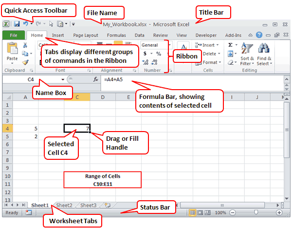
In the image above, cell C4 is currently selected. The Formula Bar is showing that cell C4 contains a formula, which you can identify because it starts with an equal sign (=). The formula is adding the values found in cells A4 and A5.
Almost everything else you need to know about Excel is explained in Microsoft's own getting started guide found online or in Excel's Help system.
More Excel Tutorials
- 1 Min 24 Sec - How to Freeze Panes in Excel (lock the upper rows or left column from scrolling)
- 2 Min 46 Sec - How to Use AutoFill in Excel (to quickly create lists of numbers, month names, etc.)
- 6 Min 10 Sec - How to Use FlashFill in Excel (to quickly reformat lists)