Box and Whisker Plot Template
A box plot or box and whisker plot can be created in Excel using the new built-in Box and Whisker chart for Excel 2016 or later. To create your own chart, you'll need to use a couple of tricks. First, the box can be created using stacked column charts. Second, the whisker can be created using y-error bars. Excel provides built-in functions that you will need to calculate the quartiles used for the "box" part of the box and whisker plot. You can jump right in by downloading the free Box Plot Template below, but I also suggest you read through the information below which describes how the functions and calculations are used to create a box and whisker plot.
Box Plot Template
for Excel (without using the new built-in chart type)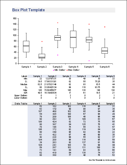
Download
⤓ DownloadLicense: Private Use (not for distribution or resale)
"No installation, no macros - just a simple spreadsheet" - by Jon Wittwer
Description
Create a box plot quickly and easily. Enter your data into the Data sheet and the chart in the Plot worksheet will update automatically.
Limitation: This template shows only the maximum or minimum outliers, if there are any. Normal convention for box plots is to show all outliers. To show all outliers, you can use the new Box and Whisker Chart that is a new built-in chart type in Excel 2016 or later (see the template below).
Regarding Negative Values: Using bar charts to display the interquartile range limits the technique described below to displaying positive values (or at least Q1 must be positive). There are a couple ways around this problem and both of these alternate methods are included as additional worksheets in the file. (1) You can shift the data so that it is positive before creating the box plot and (2) you can avoid the use of bar charts and display Q1, Q3, and the Median using series markers instead.
Box and Whisker Chart Template
for Excel (Using the new Box and Whisker Chart type for Excel 2016 or later)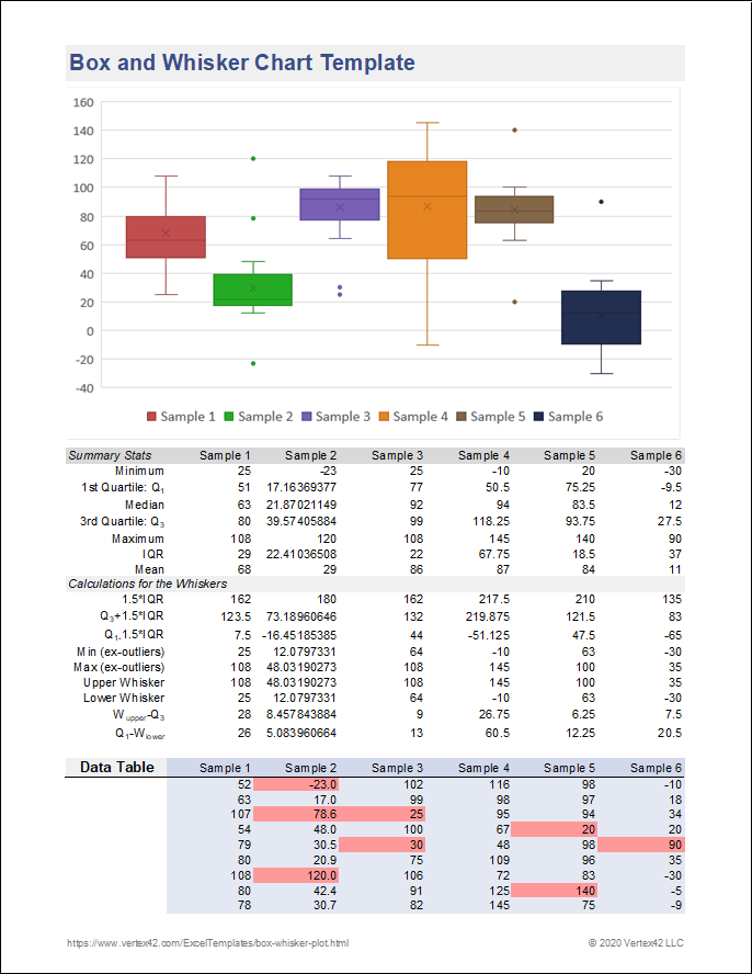
Download
⤓ ExcelLicense: Private Use (not for distribution or resale)
Description
This template uses the built-in Box and Whisker Chart. Although the chart does not require you to calculate the summary statistics, I included the formulas so that I could figure out how Excel was doing things in their chart.
IMPORTANT: The new built-in Box and Whisker Chart in Excel 2016 shows whiskers that exclude the outliers. See below for more information about creating a box plot, and how the new 2016 may differ from my original template (or other conventions).
Creating a Box and Whisker Plot
Box plots are very useful data visualization tools for depicting a number of different summary statistics and especially for graphically comparing multiple data sets. It is much easier to create these plots in Excel if you know how to structure your data. You can take a look at the template as an example.
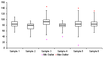
Fig 1. An example box and whisker plot from the Box Plot Template showing the IQR, whiskers, and max/min outliers.
Creating the Box
The box part of a box and whisker plot represents the central 50% of the data or the Interquartile Range (IQR). The lower edge of the box plot is the first quartile or 25th percentile. The upper edge of the box plot is the third quartile or 75th percentile. You may want to check out my article on percentiles for more details about how percentiles are calculated.
- Find the first quartile, Q1, using =QUARTILE(range,1) or =PERCENTILE(range,0.25)
- Find the median, Q2, using =MEDIAN(range) or QUARTILE(range,2) or =PERCENTILE(range,0.5)
- Find the third quartile, Q3, using =QUARTILE(range,3) or =PERCENTILE(range,0.75)
- Calculate the interquartile range (IQR) as Q3-Q1
- Calculate the mean using AVERAGE(range). The mean is not always displayed in a box plot, but in the new built-in Box and Whisker Chart for Excel 2016+, it is shown as an "x".
Note: To exclude the median when calculating the quartiles, you can use the new PERCENTILE.EXC and QUARTILE.EXC functions. It appears that the older PERCENTILE and QUARTILE functions are the same as PERCENTILE.INC and QUARTILE.INC functions.
The location of the median line relative to the first and third quartiles indicates the amount of skewness or asymmetry in the data. If the distribution is symmetric, the median will be exactly in the middle. if the median is closer to Q3, the distribution is negatively skewed (or "skewed to the left" meaning the left tail of the distribution is longer). If the median is closer to Q1, the distribution is positively skewed.
The plot in Excel is created using a stacked column chart with 3 series. The first series (bottom column) is Q1 and the border and area properties are set to none so that the column is not visible in the chart. The second series is Q2-Q1. The third series is Q3-Q2. These two series, stacked together make up the interquartile range. The area property is set to none for these two series to create just the outline for the box.
Creating the Whisker
The whiskers in a plot represent the tails of the distribution. The whiskers can be created using error bars in Excel. Because of the ease of calculation, the convention for the length of the whisker that I have used in the box plot template comes from [1]:
- The upper whisker starts at Q3 and extends upward to Q3+1.5(IQR) or the maximum value, whichever is lower.
- The lower whisker starts at Q1 and extends downward to Q1-1.5(IQR) or the minimum value, whichever is greater.
For the built-in Box and Whisker chart in Excel 2016+, the upper whisker starts at Q3 and extends upward to Q3+1.5(IQR) or the maximum non-outlier value, whichever is lower. Similar change for the lower whisker.
Another common convention is that instead of extending the whisker to a calculated value of Q3+1.5(IQR), the whisker is extended to the last data point that is less than or equal to Q3+1.5(IQR), and similarly with the lower whisker.
In the box plot template, the whiskers are created by adding Y-error bars to series 1 (Q1) and series 3 (Q3-Q2).
Outliers
The biggest problem with creating your own box and whisker plot in Excel is showing all the outliers - the points that fall outside of the range depicted by the box and whiskers. This is a problem because you don't know how many outliers there will be. Instead of showing a point for each outlier, the custom box plot template above shows only the max and min values if they are outliers. For reference, the number of upper and lower outliers is given in the table to indicate if there are more outliers than just the max or min.
The new built-in Box and Whisker Chart for Excel 2016+ can show all of the outliers. You can also select an option to show all internal (non-outlier) data points as well.
Variations
I haven't found a good way to create the following box plot variations in Excel, so I won't describe them in detail, but I've included them here for your information. Most good statistical software like MINITAB® will be able to include these additional features.
Variable-Width Box Plot
Notched Box Plot
How to Set up a Data Table for the Box and Whisker Chart in Excel 2016+
I've included this example to show how Excel requires that you set up your data table if you are using the new built-in chart type.
Note that the columns are different series (which can be displayed via the Legend), while the use of titles along the X-axis requires you to use a column like column A for identifying the groups.
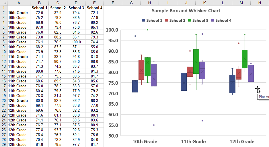
In my template above, I prefer using columns for different data sets, so I'm using the Legend to label the chart, with the x-axis label removed.
Other Statistics Spreadsheets
- Pareto Chart - This template helps you perform a pareto analysis to analyze most significant factors.
- Control Chart - Create an X-bar, R or S Chart for process control.
- Dot Plot - How to create a dot plot in a spreadsheet without a chart object.
References
- Box Plots at wikipedia.com - This is actually a really good article.
- [1] A. Mitra, Fundamentals of Quality Control and Improvement, 2nd ed., Prentice Hall: New Jersey, 1998.
- [2] S. B. Vardeman, Statistics for Engineering Problem Solving, PWS Publishing Company: Boston, 1994.
- Built-in Box and Whisker Chart in Excel - Read about the new chart type.
- More Details about the new Excel Chart - Talks about the definitions as well as the difference between including or excluding the mean.
