Conditional formatting is one of my favorite features in both Excel and Google Sheets. I love the way it can make a boring hard-to-interpret spreadsheet more interesting and easier to use.
Conditional formatting is mostly used for data analysis, such as adding color scales, highlighting high and low values, identifying duplicates, and marking outliers. Conditional formatting can be also used for graphical interface elements such as progress bars, graying out completed tasks, changing number formats, or displaying a gantt chart.
In this article, I'll show over 20 different ways that you can use conditional formatting, starting with some basics and presenting some advanced techniques as well. Many of the examples come from templates that you can download and experiment with.
Download the Example File (ConditionalFormatting.xlsx)
This Article (bookmarks):
- What is Conditional Formatting?
- How to View and Edit Conditional Formatting Rules
- Rule Order Matters
- How to create an In-Cell Progress Bar
- How to Highlight Every Other Row
- Conditional Formatting Based on Another Cell
- How to create a Formula Rule
- Create a Gantt Chart
- Use Data Bars to Compare Two Groups
- Control Scaling by Linking Min/Max to Cells
- Change Number Formatting with CF Rules
- How to Copy Conditional Formatting
- Conditional Formatting is Volatile
What is Conditional Formatting?
Conditional Formatting in a spreadsheet allows you to change the format of a cell (font color, background color, border, etc.) based on the value in a cell or range of cells, or based on whether a formula rule returns TRUE.
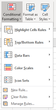
To Apply Conditional Formatting in Excel: First, select the cells you want to format. Then, go to Home > Conditional Formatting and select an option from the built in menu, or click on Manage Rules.
To Apply Conditional Formatting in Google Sheets: First, select the cells you want to format. Then, go to Format > Conditional Formatting and click on "Add another rule" in the side panel.
NOTE Google Sheets currently provides fewer conditional formatting options and controls than Excel (for example, no data bars or icon sets). The focus of this article will be on how to use conditional formatting in Excel, but many of the techniques will apply just as readily to Google Sheets.
Here are a few things you can do with the built-in options in Excel:
1. How to Highlight Duplicates
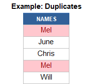
Select your range of cells, then go to Home > Conditional Formatting > Highlight Cells Rules > Duplicates.
After viewing the duplicates, you can decide whether you need to remove them manually or use the built-in tool via Data > Data Tools > Remove Duplicates.
Highlighting duplicates in Google Sheets requires using a custom formula rule such as =COUNTIF(A:A,A1)>1 to highlight the duplicates in column A.
2. How to add Color Scales
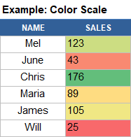
Select your range of cells, then go to Home > Conditional Formatting > Color Scales and pick the color range that makes sense (usually, green=good and red=bad).
Color Scales are very useful for seeing high and low values within a large data set. Color Scales can also be used to create heat maps, like this Calendar Heat Map Chart:

3. How to add Data Bars in Excel
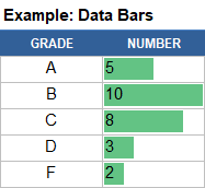
Select your range of cells, then go to Home > Conditional Formatting > Data Bars and select the style you want.
Data Bars let you create horizontal bar charts and progress bars directly within a group of cells. In the example on the right, I'm using data bars to show a histogram of class grades.
The default settings for Data Bars scale the bars automatically based on the values in the Applies To range. You can control the scale used for the bars by editing the rule's settings. I'll be showing a couple examples of that later in this article.
4. How to Highlight Overdue Dates

To highlight overdue dates:
- Select the range of dates and go to Home > Conditional Formatting > Highlight Cells Rules > Less Than...
- Enter =TODAY()+30 to highlight dates earlier than 30 days from now. Enter =TODAY() to highlight dates earlier than today.
- Choose a format option from the drop-down box, then click on OK.

Examples of this technique can be found in the Equipment Calibration Log and To Do List templates.
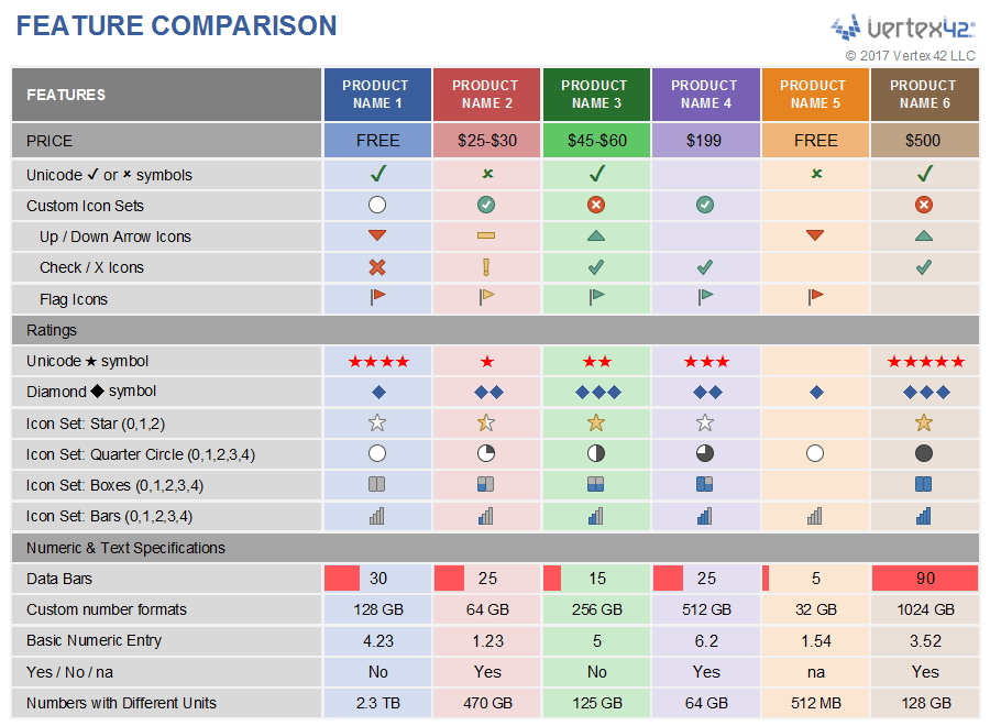
5. How to Add Icon Sets in Excel
To add Icon Sets, select your data and then go to Home > Conditional Formatting > Icon Sets > and choose one of the options. You will amost always have to customize the settings for Icon Sets.
This example, based on the Checkbook Register Template, uses a green circle icon (⬤) to show when an account balance is >=$500, yellow/orange (⬤) when it is less than $500, and red (⬤) when the balance is negative.
After selecting the icon set from the built-in menu, you need to edit the rule to define these different values. To do that, select one of the cells in the Balance column, go to Home > Conditional Formatting > Rules Manager and click on Edit Rule. The image below shows the settings used in this example:
![]()
TIP: One of the best ways to learn how Icon Sets work is to play with all of the different drop-down options in the rule settings.
For examples of other Icon Sets, check out the Feature Comparison Template:
How to View/Edit Conditional Formatting Rules
Vertex42 has many templates that use both simple and advanced conditional formatting techniques. If you are using a template and want to figure out how the conditional formatting works, or want to delete or change rules, you will need to know a couple of things:
1) To view the rules for selected cells, go to Home > Conditional Formatting > Rules Manager
2) To view ALL the rules in the entire worksheet, select "This Worksheet" from the drop-down at the top of the Rules Manager window.
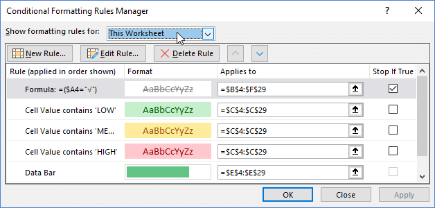
The image above shows the 5 rules used in the Task Checklist Template. The first rule changes tasks to gray strike-through when the Done column has a check mark. The next 3 rules highlight specific text in the Priority column. The last rule adds a Progress Bar in the % Complete column.

I will be using this template to demonstrate some techniques and key facts about conditional formatting, so I would recommend that you download it and experiment with it as you continue to read.
Rule Order Matters
The Task Checklist Template mentioned above demonstrates two key points about rule order or heirarchy.
- Conditional formatting rules are evaluated one at a time starting with the rule listed at the top.
- A later rule cannot override the formatting already modified by a preceding rule.
Here is the list of rules again:
Key Point #2 means that if the first rule has already changed the font color to gray, the following rules cannot change the font color to green, yellow, or red. It's first come, first serve.
In Excel, the font color and fill color (and border, and font style, and ...) can be affected independently by different rules. This means that you can have one rule that changes a font to gray, a different rule that changes the cell color to red, and a different rule that adds a data bar.
Why do I need to check the Stop-If-True box?
With the Stop-If-True box checked, none of the following rules will be evaluated if the condition of that first rule is met.
That is why the first task row doesn't show a Data Bar in the %Complete column and why the Priority "HIGH" is not highlighted red.
What would happen if I didn't check the Stop-If-True box? Go ahead and try it ... or look at the next image.
 Result when Stop-if-True is Not Checked
Notice how the red fill color is applied to the HIGH cell. The first rule does not define a fill color, but it does change the font color. That means that the 4th rule can change the fill color to light red, but it can't override the font color.
Excel vs. Google Sheets: In Excel, the Number Format, Font Color, Font Style, Font Underline, Font Effects, Fill Color, Fill Effects, Border Color, Border Style, Data Bars, and Icon Sets can be affected independently by different rules. That isn't the case in Google Sheets. In Google Sheets, conditional formatting behaves as though all rules are Stop-If-True. Excel is much more flexible and powerful in that respect.
How to Create an In-Cell Progress Bar

You've already seen how to add a Data Bar, so using a Data Bar for showing progress based on a percentage is as simple as making a few changes to the Data Bar settings.
To see how it works in the Task Checklist template, go to Home > Conditional Formatting > Manage Rules, click on the Data Bar rule, then click on the Edit Rule button.
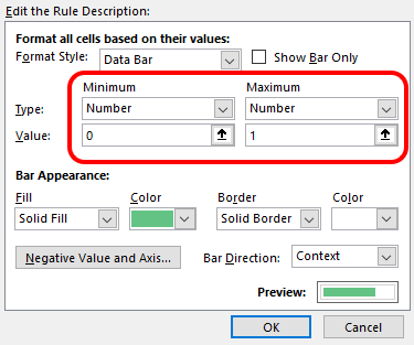
The progress should be a value between 0% and 100%. When you create a progress bar, you need to change the Minimum value to Type:Number & Value:0, and change the Maximum to Type:Number & Value:1.
NOTE Google Sheets currently doesn't provide an in-cell data bar option. But, you can mimic the effect using the formula =REPT("█",ROUND(percent*10,0)).
I've attempted to figure out a way to change the color of the data bars conditionally, but the best I've been able to come up with instead is to use a 3-color scale in addition to a gray data bar. This can help if you want to use the color to signal an incomplete task.
How to Highlight Every Other Row Using a Formula
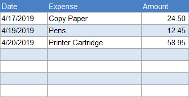
Highlighting every other row can help make tables more readable like in the expense tracking example. To do this in Excel (without needing the Tables feature), you can create a formula-based conditional formatting rule.
- Select the cells you want to format (except the header).
- Go to Home > Conditional Formatting > New Rule.
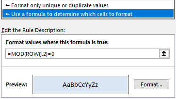
- Select "Use a formula to determine which cells to format."
- Enter the formula =MOD(ROW(),2)=0.
- Click on Format then select a color in the Fill tab.
Likewise, to highlight every other column, you could use the formula =MOD(COLUMN(),2)=0.
This technique allows you to insert and copy/paste rows without having to update the background colors manually, but it has one major drawback: conditional formatting overrides manual formatting.
Key Point: Conditional formatting overrides manual formatting.
This means that if you want to change the fill color of a cell in your table, but the conditional formatting rule is already changing the fill color, you won't see the change that you are making. You ARE editing the fill color, but you won't see the change because conditional formatting is overriding your format.
If you want to manually change the fill colors in your table AND highlight every other row, you may need to use the Format as a Table feature in Excel.
NOTE Google Sheets has a feature listed right underneath Conditional Formatting called Alternate Colors. This works separate from conditional formatting and DOES NOT override custom formatting! I LOVE that!
Conditional Formatting Based on Another Cell
To change the format of a cell based on another cell, or based on a range of cells, use a formula rule to determine which cells to format. Formulas can be simple or very complex. You can use most of the standard spreadsheet functions such as IF(), AND(), MATCH(), SEARCH(), COUNTIF(), SUMIF(), etc.
How to Create a Formula Rule
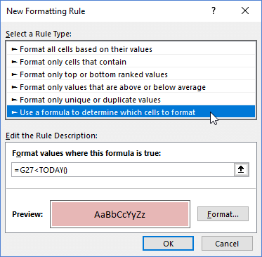
To create a formula rule, select "Use a formula to determine which cells to format" after clicking on New Rule from the Conditional Formatting menu or from within the Rule Manager.
A formula rule is activated when the formula returns TRUE.
For example, =G27<TODAY() will apply the format when the date in cell G27 is overdue (less than today's date).
To format based on multiple conditions, use the AND() function in your formula. For example, =AND(A1>10,A1<20) will apply a format when cell A1 is between 10 and 20.
Formula Rules can be very tricky! When using relative references (references without dollar signs in front of the column letter or row number), you need to write your formula based on the top-left cell in the Applies To range. When you are creating the rule for the first time, write your formula based on the top-left cell that you have selected.
IMPORTANT: Always write the formula based on the top-left cell in the Applies To range!
How to Highlight an Entire Row
The Work Breakdown Structure template shows an example of highlighting an entire row when the value in the Level column is equal to 1.

The formula we are using is =($B6=1), and this applies to all the cells in the range $B$6:$G$30. One formula to rule them all! But how does it work?
Behind the scenes, Excel is essentially copying this formula to each of the cells in the Applies To range. When a formula is copied, relative references (no dollar sign) will change. This means that for cell C15, the formula would become =($B15=1). Column B stays the same (because of the dollar sign in front of the B), but the row changes.
Key Point: In Conditional Formatting Rules, absolute references stay the same ($B$1) and relative references (A1) change as Excel applies the formula to each cell in the Applies To range.
If you aren't familiar with how absolute and relative references work, you may want to learn more about that. It's absolutely critical for understanding formula-based conditional formatting.
How to Highlight Cells Based on a Range
You can use the MATCH() function within a conditional formatting formula rule to highlight cells whose values are found in another range or list.
For example, in the Yearly Event Calendar, dates are highlighted in the calendar if the date is found in the list of holidays, as shown in the image below.

The formula is =MATCH(this_date,date_range,0) where this_date is A10 (a relative reference to the top-left cell in the Applies To range), and date_range is $Y$9:$Y$300 (an absolute reference to the list of holidays in column Y).
The MATCH formula only returns TRUE if it finds this_date within date_range. (See VLOOKUP and INDEX-MATCH Examples to learn about lookup formulas).
How to Highlight Values NOT in a Range
In some spreadsheets, I use conditional formatting to highlight values that are NOT within another range. Along with Data Validation, this can help with error checking.
The formula for the rule is =ISERROR(MATCH(this_cell,other_range,0)). This returns TRUE when MATCH does not find this_cell within other_range.
I've used this technique in my original Money Management Template to verify budget categories.
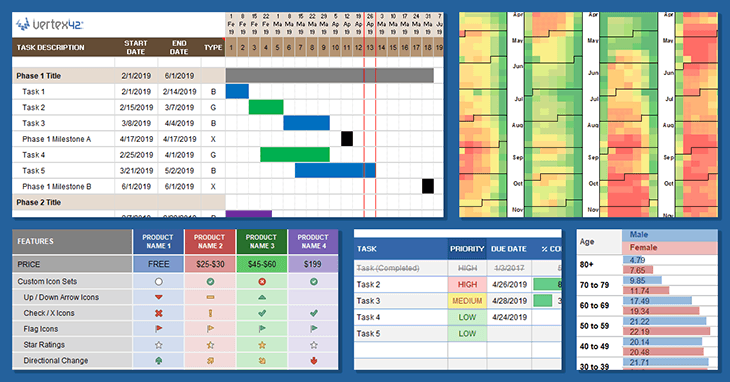
How to Use Conditional Formatting to Create a Gantt Chart
Watch the new Video Series: How to Make a Gantt Chart in Excel!
Most of my Gantt Chart Templates use a combination of many conditional formatting rules. The example below (from the Simple Gantt Chart) demonstrates (1) how to create the bars that show the date range for each task and (2) how to show the current date using a red border.
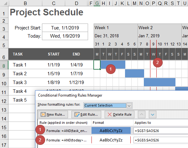
Rule 1 uses the formula =AND(task_end>=G$5,task_start<G$5+1) where task_end is a relative named range defined as $D7 and task_start is a relative named range defined as $C7. Using named ranges isn't necessary. The formula could be written as =AND($D7>=G$5,$C7<G$5+1)
Rule 2 can use the same formula, with today's date in place of both task_end and task_start. Or, the rule could be as simple as =G$5=TODAY().
The proper use of absolute and relative ranges is absolutely critical here. So, pay special attention to the placement of the dollar signs.
Note You may notice that row 7 is hidden in the screenshot. The reason for hiding the first row of the gantt chart is so that if a person inserts a row above row 8, it will use the formatting from row 7 rather than the formatting from row 6.
Using a "No-Format Stop" Rule
In some of my Gantt charts, such as the Construction Schedule, the user can pick the color of each bar. Each different color requires a separate conditional formatting rule.
One way to do this would be to add the color condition to each rule like this: =AND($D7="red",task_end>=G$5,task_start<G$5+1).
However, I often prefer to use what I call a "No-Format Stop" Rule. Instead of saying where you want the color to be applied, this rule defines where the color should NOT be, and stops if true.

This No-Format Stop rule can be as simple as adding NOT() around the main gantt chart rule like this =NOT(AND(task_end>=G$5,task_start<G$5+1)). It's called a "No-Format" rule because no formatting is applied. Its only purpose is to prevent the rules that come after it from being applied.
The following rules then need to only check for what color to assign. In the example, the color is entered in column D. When cell D7 is blank, the bar will be gray. When D7="B", the bar will be blue ... and so on.
Use Data Bars to Compare Two Groups
Charts like the population example below are popular for comparing two different groups.

The trick to creating a chart like this with Data Bars is to use two different columns. The settings for the Male column use the "Right-to-Left" direction as shown in the image below.
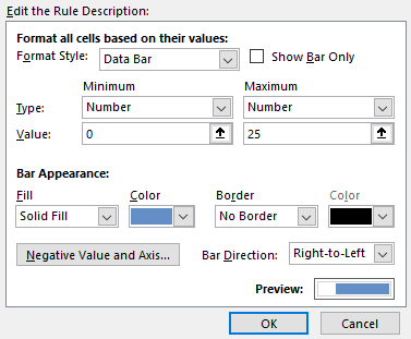
!!! The column widths and the Min/Max values need to be identical for both columns of data, or the visual display will misrepresent the numbers. In this case, the Minimum is 0 and the Maximum is 25 for both the blue data bars and the red data bars.
You could argue that this type of graph is not ideal for making exact comparisons between the Male and Female population. For example, if the numbers weren't included in the chart, could you tell that for Age 40 to 49 there were more females (20.48 vs. 20.14)? No, you couldn't. The bars look like they are the same length.
Our brains make better length comparisons when two things are aligned and parallel. The next chart uses Data Bars arranged a little differently. Now you CAN see the difference between the Male and Female population.

Control Scaling by Linking Min/Max to Cells
A great solution for controlling the scaling for Data Bars and Color Scales is to link the Minimum and Maximum values to cells that you can edit. Using this approach, you can have different rules using the same Min/Max values. Here's an example:

To do this, edit the rule settings with cell references like this:

The green data bar and blue data bars in this example are separate rules, but both rules use Min/Max values linked to cells C139 and D139.
Change Number Formats via Conditional Formatting
Some tricks I like to use in my templates involve changing the custom number format via conditional formatting based on user-selected options. If you aren't already familiar with how to create custom number formats, I would encourage you to read the article Custom Number Formats in Excel.
Suffice it to say for now that you assign custom number formats by going to the Number tab when editing the Format for a conditional formatting rule.

Change Date Formats to d/m/yyyy
If you are sharing a file with people from different countries, you may want a simple way to switch the display of dates from m/d/y to d/m/y. I use this technique in Gantt Chart Template Pro.

The date in cell F131 displays a date as m/d/yyyy by default, but when the user selects "dmy" in cell D131, the CF rule changes the format to d/m/yyyy.
You could set up similar options to switch time formats between standard and 24-hour time, or change the display of numbers from decimal to fractions.
Note Developers: To avoid having to switch between date formats, use the built-in date formats marked with the asterisk (*) when you can. From Excel: "Date formats that begin with an asterisk (*) respond to changes in regional date and time settings that are specified for the operating system."
Hide Zero Values
This example shows 3 different ways to hide zero values using conditional formatting.

- The 2nd column hides the zero values by changing the font color to white.
- The 3rd column changes the custom number format to " - ".
- The 3rd column changes the custom number format to " ".
I personally prefer replacing zeros with a dash because otherwise the cell looks blank, and cells that look blank tend to be deleted or overwritten because you think they are empty.
Automatic Indenting
A custom number format will allow you to add text characters before or after the number, so you can simulate indenting by adding a number of spaces before your text using the format code " "@.
I use this technique in both the free Work Breakdown Structure template, and the premium Gantt Chart Template.

In this example, the formula is counting the number of decimal points in the WBS number. One rule adds 3 spaces before the text if it finds 1 decimal point. A second rule adds 6 spaces before the text if it finds 2 decimal points. See the article Text Manipulation Formulas to learn how this formula counts decimal places.
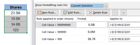
Display 23K, 23M, or 23B Based on the Value
Displaying large numbers as thousands, millions, or billions is VERY common, but how do you automatically display "K" or "M" or "B" depending on the value of the number? Using 3 different CF rules with the custom format codes 0.0K, 0.0M, and 0.0B.
Display Custom Icons
Excel has a limited number of icons available for Icon Sets. However, if you use unicode symbols and emojis, you can create your own icons using multiple CF rules. The format codes in this example are simply 0* X where X is the unicode character. To place the icon on the left with the number on the right, you could use X* 0.00 instead.
![]()
Check out the Moon Phase Calendar to see how it uses conditional formatting to replace dates in a calendar with moon phase unicode characters.

How to Copy Conditional Formatting
The simple answer is that unless you tell Excel or Google Sheets NOT to, conditional formatting will be copied whenever other formatting is copied. For example, when you copy/paste cells, when you use the format painter tool, and when you insert rows and columns.
Copying conditional formatting may not always behave the way you expect it to. Sometimes that may not matter, but in other cases it may cause significant errors in how the data is interpreted. So, it's always a good idea to check your conditional formatting rules after copying/pasting.
One of the main problems I've seen occurs when copying a row and inserting the copied row. Rules may be split, resulting in separate rules for different ranges when you expect there to be only one rule for the entire range. This can cause problems with color scales and data bars, especially.
To avoid the problem of splitting CF rules, when pasting you can use Paste Special and choose the "All Merging Conditional Formats" option.
Conditional Formatting is Volatile
If you use a lot of conditional formatting in your worksheet, or the rules involve inefficient formulas, you may notice Excel appear to slow down. That is because Conditional Formatting is volatile - meaning that the rules are evaluated every time the display refreshes.
To experiment with this concept, I built the following example. The fire in the display will flicker every time rules are evaluated, allowing you to test actions that cause the display to refresh.

Download the Example File (VolatileCF.xlsx)
Wrap Up and Final Tips
If you like this article, or use some of these ideas, please share the link to this article via your website and social media!
I didn't talk about all the possible uses for conditional formatting, and not even some of the most common uses, such as making negative values red and highlighting based on specific text values. That is partly because many of these techniques are extremely easy to implement using the built-in options.
If you have questions, please go ahead and submit a comment below.
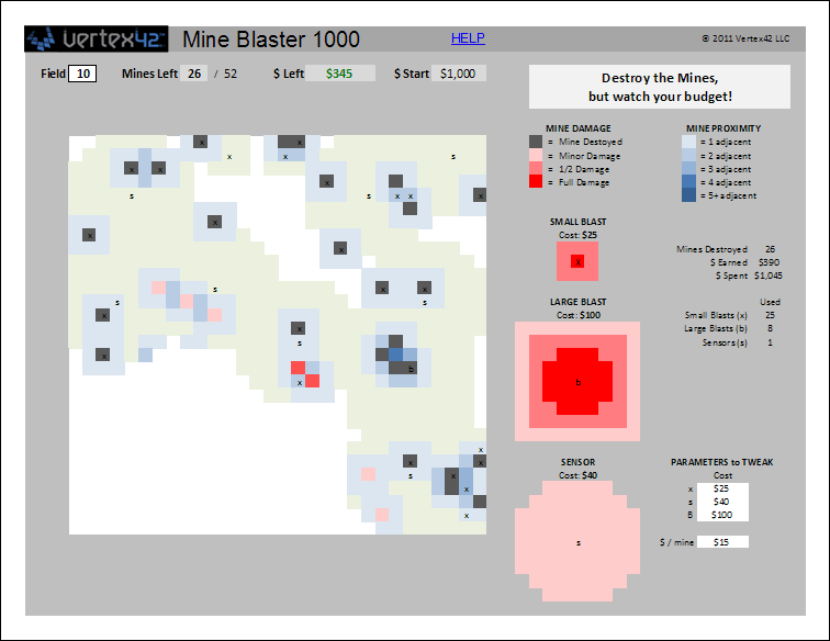
If you'd like to try some geeky fun, check out the Mine Blaster 1000 game. It makes use of multiple overlapping conditional formatting rules to create a game something roughly like Minesweeper (without any VBA).


Comments
Thanks for the article. Sometimes, when I write a formula for a conditional format rule, Excel changes the reference to something crazy like XFD1048573, and then I have to fix it. Any idea what’s going on?
@Anon … When you copy and paste cells with formulas, if the relative references would become a negative row number (a row above row 1) or a negative column number (i.e. a column to the left of column A), you get a #REF! error in your formula. However, Conditional Formatting wraps around to the bottom of the sheet or to the right side of the sheet instead of changing references to #REF!.
For example, let’s say you have a rule defined as =(B5=”Yes”) and the Applies To range is $D$5:$D$100. If you change the Applies To range to $A$1:$A$100, your formula doesn’t stay =(B5=”Yes”), because the formula is based on the top-left cell in the Applies To range. B5 is 2 cells to the left of D5. So, when you change the Applies To range to A1:A100 (now A1 as the new top-left cell), Excel tries to change B5 in your formula to the reference that is 2 cells to the left of A1. Instead of a #REF! error, it wraps around to the right end of the sheet. If your sheet had only columns A:Z, then the new reference would become Y1 … because Y1 is two cells to the left of A1. So, the reference XFD1048573 looks crazy because that is close to the right-bottom cell in your worksheet.
A Quick Note … In Google Sheets, CF formula rules currently don’t allow the use of the NETWORKDAYS and MATCH functions. I recently created a GS version of my Shift Work Calendar template and you can check out the GS version to see the massive work-around that was required to make it work. Essentially, I had to place formulas that use the NETWORKDAYS and MATCH functions in different cells and then use CF rules to refer to those cells. Also, to display holidays as bold/underlined font separate from the rotation pattern required double the number of CF rules.
“If you aren’t familiar with how absolute and relative references work, you may want to learn more about that. It’s absolutely critical for understanding formula-based conditional formatting.”
YAY! That’s why I’m here. I have built some relative reference sheets and want to learn to do some conditional formatting with them.
@Darlene, Excellent. Did you have a question? There is an article on trumpexcel.com about absolute and relative references.
Hi, I have a formula I cant seem to get right. I have a 12 month calendar at the top of the worksheet, underneath I have 3 columns, one where I type in the date, another where I select a leave code (i.e. AL is for annual leave) from a dropdown, then a simple tab for comments. What I’m trying to do is when you type in the date and select the code the date will highlight on the 12 month calendar dependant on the leave type selected. I’ve tried IF and AND formulas and they just don’t work properly do you know a way to make this work? Thanks.
@Paul … You could try a COUNTIFS formula because you are wanting to check for two conditions (1) the correct date and (2) the correct leave code. For example, =COUNTIFS($A$10:$A$500,C1,$B$10:$B100,”AL”)>0 where $A$10:$A$500 is your date range, C1 is the date you want to highlight in your calendar, $B$10:$B100 is your leave code range.
I am not sure what I am doing incorrectly when trying to do conditional formatting:
I have tried with full columns as well as individual cells. My formula looks like this: =$E:$E=”Yes”
format grey
applies to =$F:$F
I then go to my document and choose Yes from the pull down menu and it does not change any cells. Please advise
@ana … Select cell F1, then use the formula =$E1=”Yes” (do not include the $ sign in front of the 1), then test to make sure it works with just that cell, then change Applies To” to $F:$F.
Hi, thank you for creating a well organized and detailed article. I am currently using the template of Gantt chart. I am struggling with changing weeks to months as we have project that will take years to complete. Please can you share how to do it.
@Umber, It is currently near the top of my to-do-list to create Part 3 of “How to Make a Gantt Chart” to show how to switch between daily/weekly/monthly.
Hi,
Is there a way of getting a task to repeat? For example, I want the meeting in cell A20 to repeat every week.
Thanks.
If you based your conditional format rule on the value of a cell instead of just a beginning and end date, then you could use a formula within the cells of the chart area to display an “X” according to how you want the meeting to repeat. I have an example of that in a couple of the files included with gantt chart template pro.
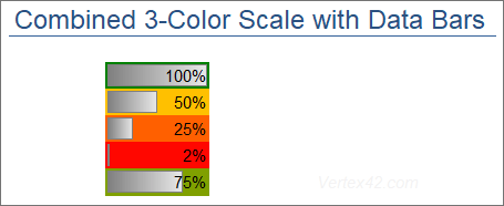
G’day Jon…found your site today when googling for formatting data bars. I have a question which I couldn’t find the specific answer for here; I need to show a straightforward data bar (which I’ve been able to set up), but would like it to show as either, red, orange or green, based on the percentage of project completed. I can change the data bar to show ‘3 colours’ but that just gives me a solid colour in the whole cell – I’d like it to be an ‘in-cell’ progress bar with it’s own colour. Hope this makes sense! Thanks in advance…
@Greg, I know exactly what you mean, because I have attempted to do what you are asking. I’ve tried every trick I could think of to create what I would call “conditional data bars” but I came to the conclusion that it is simply not possible (without VBA). You can overlap icon sets on top of a data bar (using red/green/yellow circles for example), but one solution that I really like is to combine the “3-Color Scale” with a gray Data Bar. I’ll include this example in a downloadable example spreadsheet.
What a wonderful article! Thank you. Itching to try these out with some data sets. :)
How do I add milestones to my gantt chart?
How to insert or incorporate cost spent for each task daily or weekly? And alsop overall spent so far??
@Bharath, if you are referring to a Gantt chart, add a budget column and use SUM to get the total budget.
Do you know how to have no work days added to a Gantt chart?
See Part 2 of the “How to Make a Gantt Chart in Excel” series.
I’m working on a Gantt chart currently for a mortgage business. I’m working on showing progress on the different documents / milestones for each loan being processed. Right now I’m struggling to figure out how show one progress bar (kind of like a master bar) for 39 other individual line items that all have their own progress bar. I want the person looking at the file to be able glance at the overview and know where the file is on requested documents for that file. (I hope that make sense) if that “master progress bar” doesn’t reflect 100%, then they will know to look at the individual lines to find what’s missing.
Thanks in advance for any help on this.
M
If you are using Gantt Chart Template Pro, there is a section in the Help worksheet that explains how to calculate the overall percent complete for a group of sub tasks:
Thanks so much for the template and trainings. Do you offer paid support with an excel pro to modify the spreadsheet? I downloaded your CRM template for my small insurance office. This formula creation just makes my head start spinning. Thanks! Kyle
For excel consulting, see this page: https://www.vertex42.com/excel-consulting.html
I am new to using an Excel Gantt Chart & was wondering if I can insert daily progress comments into the bars. If I do and then move to week two of the chart the comments move forward to the wrong date. How can I fix this problem?
You can’t manually add things into the cells of the gantt chart area and also use the scrollbar. Things you add manually don’t get updated. The bars are created using conditional formatting formulas.
There are only 8 weeks display on the simple Gantt chart. Is there anyway that I can add extra weeks on it?
Yes, see the video: https://www.youtube.com/watch?reload=9&v=83UQJMTPW3o
Hi Jon, How do i add one more cell in event type label in the Yearly Schedule of Events. I need 9 labels I have tried everything and it does not work because that cell does not appear in the list. Thank you kindly for your help.
In that spreadsheet, you could insert a cell within that list of labels (don’t just add to the end of the list), or you could redefine the named range. But, each of the labels as a separate conditional formatting rule, so you’d need to duplicate one of the existing rules and redefine the new rule to reference your new label. For help with customization, you can contact ExcelRescue.net for a quote.
Super helpful- Thanks. For the section “How to Use Conditional Formatting to Create a Gantt Chart” Project schedule- my task occurs 3x per week. How do I show the bar graph on Mon/Wed/Fridays between the task start and end dates?
You could show each occurrence of the task as a separate bar. To show on a single line, you’d need to create a new custom rule or formula that not only checks for the task start and end dates, but also checks the day of the week. You’d need some type of input that allows you to define which week days the task occurs. A recurring scheduled event is not typically the type of task that a Gantt chart is used for.
thank you for the great calendar tool. how do I change =DATE($B$3,10,1) which is 2023 to 2024? I’d like to create a fiscal calendar instead of regular calendar that begins in January.
thank you,
Jennifer
$B$3 is likely referring to a cell containing the year. So change that one to 2024? The syntax for the date function is this: =DATE(year,month,day)
We want to add an additional column for a Go Live date indicator and make that date in the cell red. Could this be done through additional conditional formatting? Or would you have an idea of another to do this without manually adding a shape to the cell? If the Go Live date changes, we would want the red cell to automatically change too. Thank You!
In general, conditional formatting can be used to change the font color, but I’m not sure exactly what you are wanting. For help with customization, you could contact ExcelRescue.net for a quote for some assistance.
Hi Jon,
Please i have been battling to create CRM excel template for my Loan Collection Activity. The CRM Template should contain Call log, Recoveries made, Debtors contact list, Teams performance tracker etc. I want you to build customized Template for me that i can purchase from you. …
Hi Kingsley, for spreadsheet customization, see the https://www.vertex42.com/excel-consulting.html page (ExcelRescue may be a good option to try).
Hi Jon,
I am using your yearly calendar template in Google Sheets and can’t figure out how to change the color of the Event Type labels. Is there a way to change it, and how so?
I’m assuming you mean the “Yearly Schedule of Events” – to change the colors you need to edit the conditional formatting rules.
Thank you for this guide! Does conditional formatting work the same way in Excel for Mac?
All I can say it ‘mostly’ based on experience from many years ago and what I’ve seen from others using it. It’s been quite a while since I have used a Mac.
I found the section on using formulas for conditional formatting particularly useful. It solved a problem I was having with highlighting weekends in my project timeline.
Is there a limit to how many rules you can apply to a single range? I am trying to set up a priority system with five different color scales.
Yes and no. You can have multiple rules affecting a cell. But, as soon as the first rule in the rule order defines something about the background color, no subsequent rule will be able to override it. A “Color Scale” type of rule cannot be made to be conditionally on or off with a formula. For example, without VBA, you can’t have a checkbox somewhere that changes the color scale from blue-red to yellow-green. If you need to do something really fancy, you may be able to use 100s of value-based or formula-based rules … but you won’t get the nearly infinite color gradient that you can get from using a “Color Scale” specifically.