Calendar Heat Map Chart
A calendar chart is a visualization that shows how a data set varies with the days, weeks and months of the year. One popular variant of a calendar chart is the calendar heat map which may show data over multiple years using color gradients. A calendar chart is not a built-in chart tool in Excel, but you can create your own using conditional formatting, or use a template like the one you can download below.
Calendar Heat Map Template
for Excel
Template Details
License: Private Use(not for distribution or resale)
A no-macro spreadsheet template demonstrating the power of conditional formatting in Excel - by Jon Wittwer
Description
The purpose of this template is to demonstrate how a calendar heat map chart can be created in Excel using conditional formatting. You can use it as-is by just pasting your data into the Data worksheet, or you can use it as a starting point and define your own conditional formatting rules.
Questions?
First, read the rest of the instructions in the "How to" section below. Then, if you would like to learn more about how this template was created, or want to ask questions or have comments about it, see the following blog article:
Analyze Data with a Calendar Chart in Excel
How to use the template
1. Prepare Your Data
For this template, you need a list of unique dates in one column and a numeric value in a second column. You can have more than one column of data, but this template only analyzes one column of data at a time.
Using a Pivot Table may be a simple way to get your data into this format. For example, let's say you have a worksheet with a list of financial transactions consisting of a Date column and an Amount column. You will likely have many transactions on the same dates, but for the calendar chart you need to have unique dates. So, you need to somehow have each date represent the sum of all transactions for that date.
You can do this very quickly using a PivotTable. Select your data, go to Insert > PivotTable, and include the Date column for the Row Labels and the Amount column for the Values of the PivotTable. Modify the settings of the Amount column in the PivotTable to be a sum rather than a count.
2. Copy Your Data Into the Template
With your data prepared correctly, you just need to copy and paste it into the Data worksheet in the template (assuming you have the data in another spreadsheet). You may want to use Paste Special > Values to avoid copying formulas and formatting.
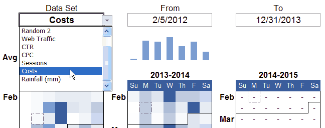
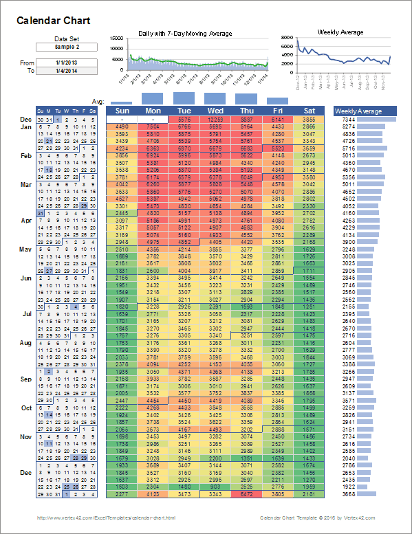
3. Choose a Data Set and Date Range
In the 4-Year and 1-Year worksheets, you can choose the Data Set you want to analyze from a drop down list. The list in the drop-down box comes from the column labels that you enter in the Data worksheet.
4. Customize Conditional Formatting
The colors in the calendar heat map are created using conditional formatting rules. You don't have to use the red-yellow-green heat map color gradient. For example, the image above shows a cost analysis with white representing zero and dark blue representing the high cost values.
To try different conditional formatting rules, first select the range of cells that you want to format (including the 4 values in the Summary Stats section) and then go to Home > Conditional Formatting. To modify existing rules, go to Conditional Formatting > Manage Rules and select "This Worksheet" from the drop-down in the Conditional Formatting Rules Manager window.
You can define multiple rule sets, and you can choose which one to use for your calendar heat map by changing the order of the rules (move the one you want to use to the top of the list).
Neither this template nor this page are intended to be a tutorial on how to use conditional formatting, but here are a few tips:
TIP #1: Use percentiles and min/max thresholds to adjust the range of colors. Outliers have a huge affect on heat maps. For example, one very large number could result in a heat map showing one red spot and everything else green. By default, I like using 10% and 90% percentiles and that is how the template is set up. This makes the top 10% of the data red and the lower 10% green, regardless of how high or low the values are.
TIP #2: Use Single-Color gradients for data that contains a lot of zeros. This can save a lot of ink compared to displaying all zero-values as dark green.
TIP #3: Use a color scheme that makes sense for your data. Avoid using colors that can cause confusion. For example, when thinking about rainfall, green makes you think of lush vegetation (a lot of rainfall) while reds bring to mind drought or no rainfall. For rainfall, which color does it make sense to use for the high value?
5. Highlighting Holidays and Events in the Calendar
The Holidays worksheet allows you to list dates that you want to display in the calendar. In the 1-Year worksheet, the dates are highlighted only in the calendar on the left. In the 4-Year worksheet, these dates are highlighted with a dashed border.
6. Decide How to Handle Missing Data
Are you correctly handling missing data (meaning either missing dates or dates with blank values)? Is missing data represented correctly in the chart? These are questions you should ask yourself when using any type of chart. In this template it is especially important because whether you use zeros for missing values or dashes affects how the AVERAGE() function works.
If you have non-numeric data in a range, the AVERAGE() function ignores those cells. For example, the average of {"-","-",1,2,"-","-"} is (1+2)/2 = 1.5. The dashes are ignored.
If missing data should represent a value of zero, then you can choose that option in the list of options on the right side of the 4-Year and 1-Year worksheets.
For example, the column of rainfall data included in the spreadsheet contains missing values. Those missing values actually mean zero rainfall was recorded on those days at that particular station. For a correct weekly average, you'd need the calendar chart to show zeros instead of dashes. For example, the average for {0,0,0,0,1,0,0} is 1 mm / 7 days = 0.143 mm/day.
Update 3/10/2016: Multiple Independent Data Sets
I added another worksheet to the template that allows you to show up to 4 independent data sets from the Data worksheet on a single page (see the screenshot below). The conditional formatting rules are different for each one, but you can define your own. You could show 4 years for a single data set, 4 different types of heat maps for the same year of one data set, or compare two different data sets over 2 years, and many other combinations.
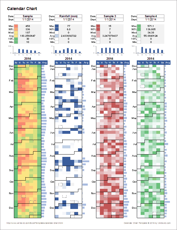
The summary stats include the 90th and 10th percentiles to help you decide how you want to adjust heat map scaling. Keep in mind that you would need to edit the conditional formatting rules to make changes to the color scaling. The summary stats are included only for reference.
Other Calendar Chart Examples
- Google Chart Tools - Calendar Chart at developers.google.com - Google's javascript-based API can display a calendar chart on a web page. Currently, their API displays the months horizontally. In my attempt to recreate this type of chart in Excel, I found it easier to display months vertically.
- CalChart by Rob Collie at PowerPivotPro.com - Rob Collie's calendar chart users Pivot Tables and Slicers. Check it out. It's awesome.

