An Introduction to Pivot Tables in Excel by Guest Author and Microsoft MVP, John MacDougall
Everyone deals with tracking income and expenses. It's a fact of modern day life, and if you don't track your money, you should.
Excel can be a great tool to track your money. The Income and Expense Template by Vertex42 is an example of a spreadsheet you can use to track where your money is coming from and where it is going.
One of the most basic tasks of managing your money is categorizing your expenses so that you know what you are spending your money on each month. In this post we'll take a look at how you can analyze and summarize your income and expenses using Pivot Tables!
This Article (bookmarks):
To follow along as we build a simple pivot table, download the file that we are using for the examples in this article:
Download the Example File (IncomeExpense-PivotTable.xlsx)
Watch the video we created to go along with this article!
What are Pivot Tables?
A Pivot Table is one of the most powerful and useful tools available for quickly summarizing data in a spreadsheet. The PivotTable feature was introduced in Excel 5 back in 1994, and has seen dramatic improvements in function and ease-of-use since then.
Pivot Tables are both fast and flexible. With pivot tables, you can easily filter, sort and summarize your data and turn thousands of rows of data into actionable insights.
How to Create a Pivot Table in Excel
Creating a pivot table is really simple!
(1) First, select the data you want to include in your pivot table:

In this example, our data is inside an Excel Table named Vertex42 and if we select any cell inside this table, Excel will know we want to use the whole table of data. Even if the data is not in a table, Excel will guess the range of data based on selecting a single cell of the data.
(2) Next, go to the Insert tab and press the PivotTable command.

This will open the Create PivotTable dialog box:

This menu allows us to choose the location of the data we want to analyze and where we want the resulting pivot table to live in the workbook.
(3) Because we already selected a cell inside our table, Excel has already populated the Table/Range field with the name of our table, so we don't need to change anything here.
(4) Next, choose where you want the new pivot table (New Worksheet or Existing Worksheet).
The default choice is to appear in a new worksheet. Excel will create a new worksheet that contains the pivot table. The other option is to choose the location in an already existing sheet and we can use the up arrow icon on the right of the location input box to do this. We will stick with the default option.
(5) When you are happy with the options, press the OK button to create the new pivot table.
Now we have a new blank pivot table:

It doesn't look like much now (because it's blank), but there is a lot we can do with it. If you'd like to learn just about everything pivot tables can do, check out my article 101 Pivot Table Tips! We'll be using a few of these tips to help analyze our income and expense data.
Pivot Table Tools
With the active cell inside the pivot table, you will see two new PivotTable Tools ribbon tabs labeled Analyze and Design:

These only show up when a pivot table is selected.
You should also see a new window pane docked on the right side of the worksheet called the PivotTable Fields list:

This window pane is the command center we'll be using to build and edit our pivot table.
If the PivotTable Fields window pane isn't visible, then you can right-click anywhere inside the pivot table and select Show Field List from the menu, as shown in the image below:

Building a Pivot Table
A blank pivot table isn't useful, so let's make something with it.
Adding fields to a pivot table is easy. Simply click-and-drag any of the fields listed in the top area into any of the Filters, Columns, Rows or Values areas.

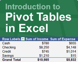
(1) For our example, drag the Account field into the Rows area and both the Income and Expense fields into the Values area.
This will create a summary of the income and expenses for each account, like this:

(2) Remove the Account field from the Rows area by dragging it back to the field list or anywhere outside the PivotTable Fields pane.

(3) Drag the Category field into the Rows area to get a view of spending by category:

This example shows how with pivot tables we can easily slice and dice the data into many different views to summarize the data.
Adding a Calculated Field to a Pivot Table
Instead of showing the Sum of Income and Sum of Expense as separate columns, we might be more interested in the net transaction for each row of our data.
The net transaction is the income amount minus the expense amount. We can add this to our pivot table with a calculated field.
(1) With the pivot table selected, go to the Analyze tab and select the Fields, Items & Sets command then choose Calculated Field from the menu.

(2) In the Insert Calculated Field window, name the new field Net Transaction and add the formula Income - Expense. Tip: Double-click on any field name in the Fields area to use it in the formula.

(3) Press the OK button and the field is now listed in our PivotTable Fields window:

You can use this field just like any of the other fields in the data. You can drag it into the Values area of the pivot table, and you don't even need to include the fields it's based on.
Creating a Monthly Summary
A monthly summary is a common type of report we want to see when analyzing our spending. Summarizing spending by category and month will allow us to see how income and expenses vary from month to month and compare this to our budgeted amounts.
Pivot tables are ideal for analyzing date and time data. When adding a date or timestamp field into a pivot table, Excel will automatically group it into Months, Quarters and Years. Other grouping options are available too, like hourly and by minute.
If you add the Category to the Rows area, the Date to the Columns area and the Net Transaction to the Values area, you will get a nice monthly breakdown of spending by category, as shown in the image below.
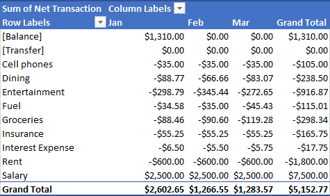
The result is a table that allows us to easily compare our spending month-to-month. For example, we over spent our monthly entertainment budget of $300 in February.
Note: If Excel doesn't automatically group the dates by month, you can right-click on any of the dates in the pivot table and select Group from the options. Then in the grouping options, select the group By Months option.

Show Values as Running Totals
Most bank statements will show the new account balance after each transaction. This is very useful for reconciling our spreadsheet with our bank statements.
If our original data doesn't show a running balance, we can create one easily with a pivot table.
(1) Add the Date field into the Rows area, the Account field into the Columns area and the Net Transaction field into the Values area.
This will show the net transaction amount by day and by account, but this is not yet a running balance:
![]()
Note: Excel might automatically group the date field into months, quarters and years. You can remove this grouping by right-clicking on any of the dates and selecting Ungroup from the menu.

The account balance is the opening balance plus any previous transaction amounts. So, you need a running total in order to see the account balance for any given day.
(2) Right-click anywhere on the net transaction field inside the pivot table and select Show Value As, then choose Running Total In, then select Date for the base field.

The pivot table now shows the account balance each day for each account:

Conclusions
In this post we explored what pivot tables are, how to create them and a bit about what they can do.
We were able to quickly summarize our data by account or category without any formulas. It only required a few point-and-click steps.
We learned how to add new calculations into our pivot tables using calculated fields, which allowed us to analyze the net transaction amounts in our income and expense data. We then used a running total calculation inside our pivot table to find the account balances at any given day.
Pivot tables are incredibly powerful and useful tools. Make sure to add them to your toolbox.
About the Author
John MacDougall is a Microsoft MVP and former actuary who regularly shares his knowledge and passion for Excel and Power BI through his website HowToExcel.org. John eventually left the financial world to join the stimulating tech world where he worked on data analysis in advertising. He currently works as an independent Excel and Power BI consultant.


Comments
Can this be used with quick books or is there really no need to?
@Coby … Probably no need to, since QuickBooks already provides a way to generate income/expense reports. This particular example would be for people who are using spreadsheet-based account registers instead of software like Quicken or QuickBooks. However, the income/expense example is just a way to demonstrate what can be done with Pivot Tables. When the software they are using doesn’t allow a data scientist to analyze the data the way they want to, it’s common to export the raw data to Excel and try using Pivot Tables, or they might take the analysis to the next level using business intelligence tools like Power BI.
Just a quick suggestion: I really like using the new Timeline feature when showing the Pivot Table grouped by date. It allows you to easily select a specific month or range of months. To add the timeline: (1) Click inside the pivot table (2) Go to the Analyze tab (3) Click on Insert Timeline (4) Check the Date field.
Many thanks for discussing these details during this incredible blog site. i will share this article in my small facebook or myspace account for my pals
Hello and thank you for your great work. I would like to know if there is a way to add a plus or a minus sign at the bottom of the last total as it is black in colour and can not see if the total is positive or negative. I hope this makes sense. Thank you in advance.
See the following article about Custom Number Formatting: https://www.vertex42.com/blog/excel-tips/custom-number-formats-in-excel.html
Many thanks for the tutorial. It’s really helpful to understand about basic pivot tables