Sparklines before Excel 2010
Sparklines are popular tools for Excel dashboard reporting, where the idea is to provide data-rich tables and graphs that help people make better and faster decisions. Excel 2010 and Excel 2013 include a Sparklines feature that lets you easily insert a line, column, or win/loss sparkline. Prior to Excel 2010, the only way to create sparklines in Excel was to either use an Excel add-in or spend a long time trying to scale down an Excel chart.
For more information about sparklines in Excel, see see this blog article. What follows is a modified version of an article I wrote back in 2006.
So what are sparklines? Edward Tufte defines sparklines in his book, Beautiful Evidence, as: "Sparklines are data-intense, design-simple, word-sized graphics." Below is an example of a sparkline created in Excel using the Bissantz SparkMaker add-in. Bissantz invented font-based sparklines and was the first to apply the technique to in-cell sparklines in Excel.
Historical data from Yahoo! Finance as of Oct 2, 2006
Other useful charts that can be displayed with fonts and fall into the category of "word-size graphics" or "in-cell graphs" include bar charts ![]() , mini pie charts
, mini pie charts ![]() , bullet graphs
, bullet graphs ![]() , and whisker graphs (i.e. win/loss charts)
, and whisker graphs (i.e. win/loss charts) ![]() .
.
Creating Sparklines via Excel Chart Objects
Although it's easier to use an add-in or the new Excel 2010 feature, I was curious back in 2006 to see if you could create sparklines using regular Excel charts. Below are some examples.
Sparklines: The image below shows a sparkline I created using a scatter plot in Excel. This let me add a 3-month moving average trend line and also adjust the length of the sparkline. The first/last and min/max points are highlighted - and the size of the markers are adjustable.
Sparkline created using an Excel scatter plot
This approach was certainly not simple - the Excel charts don't easily scale to this size (you have to scale the axes, then delete the axes, and play with the margins).
Bar Graphs: It is possible (but not easy) to make word-size bar charts using normal Excel charts. However, like the scatter plot above, the charts don't scale very well. Once you have one created, it's not too hard to copy and paste and change the source data.
Word-size bar graph created using an Excel bar chart
Pie Graphs: I couldn't get an Excel pie graph to scale down to word-size. But that is okay. I don't like mini pie graphs. When used for comparing data, scaled bar charts are much better. See the example below.
Win-Loss-Tie Records: You can create word-size whisker plots or win/loss/tie graphs using Excel's stacked bar charts.
Win/Loss graph created using a stacked bar chart in Excel
To summarize, it is possible to create some types of sparklines and other word-size graphs using normal Excel charts. But, it involves quite a bit of mouse agility and toying with chart properties to get the graphs just the way you want them. It took me a good 30 minutes to create the three charts above using Excel.
A Survey Example
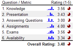
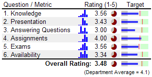
One of the applications of these word-size graphs that got me excited was the ability to summarize survey data. I threw together an example of a 6-question teacher evaluation survey (the data is made up). The first table below was created using the SparkMaker add-in and the second was created with the MicroCharts add-in (no longer available). I was very impressed with how easy it was to create the bar charts and pie graphs, and even the bullet graphs. Most of my time was spent making up the data for the tables. It only took me about 5 minutes to add the bar charts and the pie graphs using the add-ins.

Bar graphs and pie graphs created using SparkMaker
Creating the Histogram Bar Graphs: If you have survey data that consists of discrete values, such as integer rankings of 1-5, you can use Excel's FREQUENCY() formula to easily tally up the results for the histogram. You can integrate the frequency formula right into the SparkBars() function like this: =Sparkbars(FREQUENCY(A21:A61,{1,2,3,4,5})), where A21:A61 is the range containing the survey results. The frequency function is an Array Formula in Excel, so you need to press Ctrl+Shift+Enter after typing in the formula.
What is the purpose of the pie graphs? I set up the pie graphs to represent the ratio rating/5. A perfect rating would be a solid colored circle. The pie graph was created using the Excel formula =SparkPie(rating), where rating is the average listed in the table to the left of the pie graph. The color was modified by changing the cell's font color (very intuitive). Important: In this example, the pie graphs add very little value. If the idea is to compare the ratings, scaled bars would be much easier to interpret at a glance.
The table below was created using MicroCharts. Let me explain the bullet graphs a little. With instructor evaluations, it is common to compare a instructor to the performance of the department as a whole. The red vertical lines in the bullet graphs represent the average rating of for the department for each individual question. The green zone in the graph represents a "Good" range or a value between 4-5.

Bar charts, pie graphs, and bullet graphs created using MicroCharts
Important: The use of both the pie graphs and the bullet graphs is redundant. The column of pie charts should be removed. Notice how much easier it is to compare the size of the blue bars in the Target column? The bullet graph provides additional value by making it easy to see how the rating for a specific question compares to the department average, and whether the rating is in the desirable "Green Zone".
References
- "Sparklines: Theory and Practice," Active forum topic at www.edwardtufte.com on Sparklines.
- "Business Intelligence" Definition on Wikipedia.
- "Information Dashboard Design: The Effective Visual Communication of Data" by Stephen Few, 2006. Contains a description of bullet graphs and how to use them in dashboard reports.

