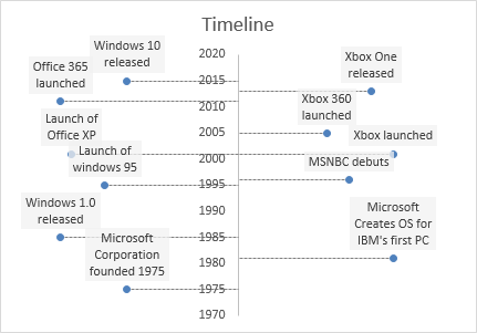
Vertical Timeline Template
A vertical timeline can be created in Excel using an X-Y Scatter Plot, Data Labels, and Error Bars for the leader lines. This technique was pioneered by Vertex42 in the original Timeline Template in 2005. Newer versions of Excel, beginning with Excel 2013, include a feature that makes creating timelines from scratch much easier than it used to be. Continue reading below to learn how to create a vertical timeline, or download the template to get a head start.
See our timeline templates page for more options.
Vertical Timeline
for Excel 2013+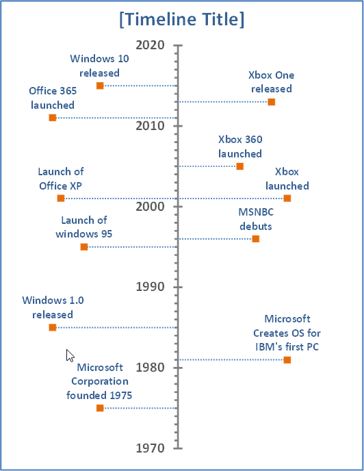
License: See the Private Use License (not for distribution or resale). This template has been licensed to Microsoft for distribution via their apps and template gallery.
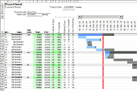
PRINTING THE TIMELINE
When printing a chart in Excel, you can select the chart and press Ctrl+P to print the chart fit to a single page. However, if your timeline is very long or you want to print the chart across multiple pages, select the range of cells behind your chart and print that range of cells.
You can use custom scaling via the print settings to print across multiple pages. You'll have to do some cutting and taping afterwards, but if you have the patience to do that, it's a reasonable way to create a poster-size timeline to display in a classroom or meeting.
How to Create a Vertical Timeline in Excel
For Excel 2013, 2016. The instructions below explain how to create your own vertical timeline in Excel using an X-Y Scatter Plot.
STEP 1: CREATE THE DATA TABLE
You'll need a column for the year, description, and the horizontal position. The image below shows the example data table used in the template.
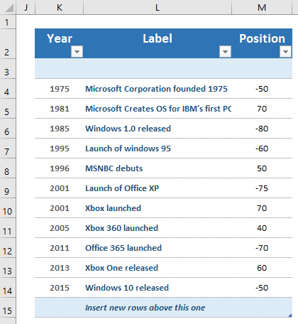
When using an X-Y Scatter Plot, it is not necessary to sort the events in the table by date. It may be convenient to format your data table as an Excel table.
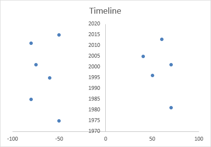
STEP 2: CREATE THE X-Y SCATTER PLOT
- Select the Year column and the Position column
- Go to Home > Insert > Charts and insert a Scatter Chart
After this step, your timeline will appear as a horizontal timeline. You now need to switch the x-axis and y-axis to make the timeline vertical. You can do that by editing the chart data source, but you can also select the data series within the chart and swap the references directly in the formula bar.
Click on the gridlines and press Delete to clean up the chart. At this point, your timeline might look like this:
STEP 3: CREATE LEADER LINES AS HORIZONTAL ERROR BARS
Leader lines connecting the markers to the axis can be created by adding horizontal error bars. To add them, click on the chart and check the "Error Bars" box in the list of Chart Elements, then follow these steps:
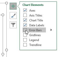
- Select one of the vertical error bars and press Delete to remove them
- Right-click on the horizontal error bars and select Format Error Bars
- Choose Minus for the direction, No Cap for the end style, and Percentage = 100% for the Error Amount.
- Format the color, width, dash type, and other aspects of the leader lines
STEP 4: ADD EVENTS AS DATA LABELS
- Right-click on the data series and select Add Data Labels
- Right-click again on the data series and select Format Data Labels
- Choose Value From Cells then select the column labels from your table.
- Choose Above for the Label Position, and uncheck the Y Value.
- For the data labels, use a solid color fill set to about 25% transparency. This allows you faintly see through the label if it overlaps other events or leader lines.
At this point, the chart will look like the example below.
STEP 5: FORMAT AND POSITION
At this point, all that is left is to format your chart how you want it and edit the position values for each of the events to get everything to fit nicely.
Format the vertical axis (color, min/max values, number format, etc.) by right-clicking on the axis and selecting Format Axis.
If you want the vertical axis on the left and all events on the right, set the horizontal axis Minimum value to 0 and edit the Positions in the table to be all positive numbers.
When working with the positioning of the events, I find it easiest to set the Min/Max bounds for the horizontal axis to -110 and 110 (or 0 and 110).
You can format individual markers and data labels by first selecting an individual data point or label.
To display the year as 15,000 BC or 2,000 AD, you can use a custom number format:
- Right-click on the x-axis and select "Format Axis..."
- In the Format Axis dialog box, go to Number, select Custom from the category list and enter the following in the Format Code box: #,##0 "AD";#,##0 "BC"
WEIRD EXCEL BUG: LABELS NOT SHOWING UP?
If you save the file with some blank rows in your data table, when you open the file later you may find that the labels don't show up in the chart when you add the labels into the blank rows. If this happens, I've found that I can delete the rows where the labels aren't working and then insert new rows and re-enter the data (or extend the table down using the drag handle).
Another work-around: In the Format Data Labels window (1) Click on the Reset Label Text button, (2) Uncheck the Value From Cells option, (3) Re-Check the Value From Cells option.