Bubble Chart Timeline
If you are willing to use drawing tools to create a timeline, there is no limit to what you can create or how creative you can get with the design of your timeline. However, if you want something more automated, you can create a timeline in Excel fairly easily, especially if you are using Excel 2013 or later.
A Bubble Chart in Excel is a relatively new type of XY Chart that uses a 3rd value (besides the X and Y coordinates) to define the size of the Bubble. Beginning with Excel 2013, the data labels for an XY or Bubble Chart series can be defined by simply selecting a range of cells that contain the labels (whereas originally you had to link individual data labels one at a time). These features make it relatively easy to create some interesting timelines with a bubble chart.
You can download the two templates I've created to get a huge head start on making your timeline, or you can follow the instructions below to learn how to create a bubble chart timeline from scratch.
Bubble Chart Timeline Template
for Excel 2013+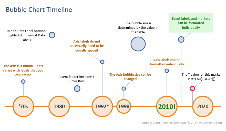
Download
⤓ Excel (.xlsx)License: Private Use (not for distribution or resale)
Vertical Bubble Chart Timeline
for Excel 2013+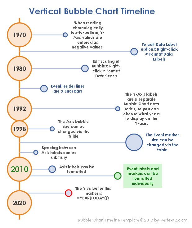
Download
⤓ Excel (.xlsx)License: Private Use (not for distribution or resale)
Create a Bubble Chart Timeline in Excel
You can follow the steps below to create your own timeline from scratch. The instructions are for creating a horizontal timeline. If you want to create a vertical timeline, you can follow the steps substituting the Y-axis for the X-axis. Also, if you want the vertical timeline to read chronologically from top to bottom, the Y-values need to be negative. The template above can show you how that works.
STEP 1: CREATE THE AXIS BUBBLE CHART SERIES
One of the things people often complain about when creating timelines in Excel is the difficulty of customizing the labels for the timeline axis.
The technique I'm presenting here overlays a Bubble Chart data series over the top of the normal X-axis. This allows you to control the spacing between the axis labels AND to add whatever labels you want. You don't even need to use numeric labels if you don't want to.
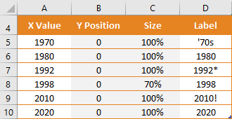
- Set up the AXIS data table (like the image to the right)
- Select cells A5:C10 and go to the Insert tab and choose the XY Bubble chart type
- Right-click on a bubble and select Format Data Series to format it the way you want
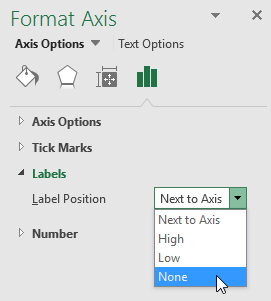
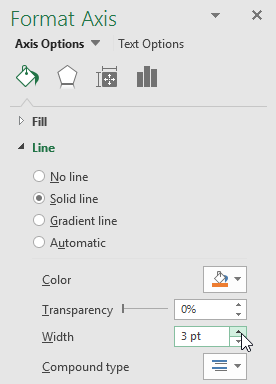
STEP 2: FORMAT THE X-AXIS LINE AND REMOVE LABELS
- Right-click on the labels for the X-axis and select Format Axis
- For the Label Position, select None
- For the Line format options, choose the color you want and increase the line width
Remove Axis Labels
Format Axis Line
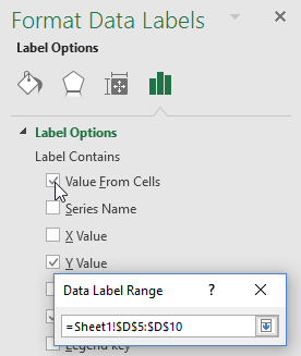
STEP 3: CREATE CUSTOM AXIS LABELS WITHIN THE AXIS BUBBLES
Choose Data Label Range
- Right-click on the axis bubbles and select Add Data Labels (these will show up as small labels that you might not notice at first)
- Right-click on the axis bubbles again and select Format Data Labels
- Check the "Value From Cells" option and select the range from your Axis Labels table
- Uncheck the Y Value and choose Center for the Label Position
- Increase the font size and modify the font format as desired. You can select and format each data label separately if you want to (like the 2010! label in this example)
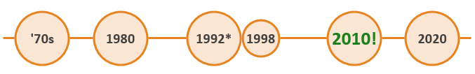
Sample Axis Using a Bubble Chart Data Series
STEP 4: ADD A NEW DATA SERIES FOR THE TIMELINE EVENTS
The next step is to add the timeline events. We can use a separate data table for listing the events. I have found that I often want to enter the date or year for an event differently than what the value needs to be for the chart.
For example, when creating a vertical timeline with events shown chronologically from top to bottom, the Y-values need to be negative. But, I want to enter the years as normal positive numbers. So, I have a separate column for the Y-value which in this case is a simple formula like =-YEAR
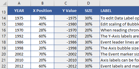
Data Table for a VERTICAL Timeline
To create the data series for the timeline events ...
- Right-click on the chart and choose Select Data
- Click on Add to add a new data series. Name it something like "Events" and choose the YEAR for the X Values, the Y Position for the Y Values, and the Size for the Size values. If you are creating a vertical timeline, the X and Y values will be swapped.
- After the bubble markers for your events show up in your chart, right-click on a bubble and select Format Data Series to choose the colors for the line and fill for the bubble markers.
Note: If the markers for your new data series don't show up in your chart, make sure your horizontal and vertical axis bounds are set to Automatic or make sure that your data actually fits within the axis bounds.
To edit the bounds for the axes, right-click on the axis and select Format Axis.
STEP 5: ADD LEADER LINES AS Y ERROR BARS
Leader lines from the timeline events to the timeline axis can be created by adding vertical error bars to the timeline event markers. To do that ...
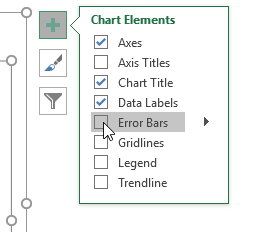
- Click on a bubble in the event series then the + symbol and select Error Bars (see the image on the right)
- Select one of the X-error bars and press Delete to remove them
- Right-click on the Y-error bars and select Format Error Bars
- Choose Minus for the direction, No Cap for the end style, and Percentage = 100% for the error amount.
- In the Line options (under the bucket), you can format the error bar lines to be the color and width that you want.
For a vertical timeline, swap "X" and "Y" in steps 2 and 3 (removing the Y-error bars and adjusting the X-error bars).
STEP 6: ADD EVENT LABELS
- Right-click on the event series and select Add Data Labels
- Right-click again on the event series and select Format Data Labels
- Like before with the axis, choose Value From Cells then select the range of labels from your table.
- Choose Above for the Label Position, and uncheck the Y Value.
- If you want to display the X-Axis value in the data label, you can check the X Value option.
- For the data labels, I like using a solid white fill set to about 25% transparency, so that if the labels overlap the leader lines, you can still faintly see the leader line behind the label.
STEP 7: MODIFY TIMELINE EVENT POSITIONS TO GET EVERYTHING TO FIT
The Y Position values in the table are used to position the markers so that the labels don't overlap. That is often the biggest challenge when creating a timeline. If you have a lot of events crammed into a short period, you may need to get creative or you may need to consider using a variable-scale axis (where the distance between the Axis Labels is not exact).
- Right-click on the Y-axis and set the Maximum bound to 1 and the Minimum bound to -0.2. The Y Positions in the Events table can be entered as a %, representing a distance between 0 and 1 (1=100%).
- After adjusting the Y-axis, you can delete it by selecting the axis and pressing Delete.
- In addition to adjusting the vertical position of the markers, you can drag individual labels to fit them as needed.
WEIRD EXCEL BUG: LABELS NOT SHOWING UP?
If you save the file with some blank rows in your data table, when you open the file later you may find that the labels don't show up in the chart when you add the labels into the blank rows. If this happens, I've found that I can delete the rows where the labels aren't working and then insert new rows and re-enter the data (or extend the table down using the drag handle).
Another work-around: In the Format Data Labels window (1) Click on the Reset Label Text button, (2) UNcheck the Value From Cells option, (3) Re-Check the Value From Cells option.
References
- Create a Timeline in Excel at Vertex42.com - The use of error bars for leader lines and data labels linked to a data table was first presented by Jon Wittwer of Vertex42 in this article Sep 2, 2005.
- Present your data in a bubble chart at support.office.com - This doesn't talk about timelines, but it shows how to create a basic bubble chart in Excel.