Timeline Template for Google Sheets
The chart features in Google Sheets are finally developed enough that you can make a decent horizontal or vertical timeline using a scatter plot and data labels. You can download the template below, or follow the basic steps provided on this page to get started on your own timeline from scratch. I don't explain all of the little details, but there are few key steps to follow if you want to try making a timeline from scratch. You can learn the rest from experimenting.
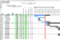
A Gantt Chart is also a type of timeline, and I have a free Gantt Chart Template available for Google Sheets as well. But if you want to make a timeline in the traditional sense, then download the template below.
Timeline Template
for Google Sheets
How to Create a Timeline in Google Sheets
STEP 1: CREATE THE DATA TABLE
You'll need a column for the Date, Vertical Position, and Event labels. The image below shows the example used in the template. If you want to show leaderlines, include a fourth column (the one I have is called "Leader Lines").
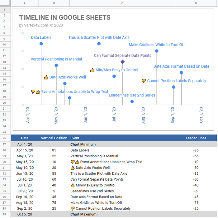
The chart will automatically scale based on the earliest and latest dates, so in this template, I've included two rows (top and bottom of the data table) that help control the scale of the timeline.
If you are going to include leaderlines, in the Leader Lines column, use a formula that makes the value equal to the negative of the Vertical Position. In cell D28 enter =-B28 then copy that formula down. Make sure all values in the Vertical Position column are positive, ranging from 0 to 100.
STEP 2: CREATE THE TIMELINE CHART
Select cells A26:D39 (the entire data table, including the headers).
Then go to Insert > Chart. The default chart may be a column chart. Ignore that. Instead, in the Chart Editor (sidebar) under Setup, choose Scatter Chart as the Chart Type.
If Google Sheets doesn't change significantly from when I created this, it will automatically assume the Event column is for data labels (but it won't shown them yet).
STEP 3: DISPLAY THE DATA LABELS
Click on the Customize tab in the Chart Editor.
Click on Series and select Vertical Position from the drop-down (the drop-down will likely default to "Apply to all series").
Check the Data Labels box, and in the Type drop-down, select Custom. This should add the data labels.
STEP 4: CUSTOMIZATION
To create leaderlines, you need to select the Leader Lines series frop the drop-down, check the Error Bars box, choose Percent in the Type drop-down and enter 200 in the Value field.
Then you need to double-click on the vertical axis labels and change the Minimum value to 0 and the Maximum value to 100.
The rest of the steps involve changing the gridline color to white (to hide them), changing the vertical axis labels to white (to hide them), removing the legend, adding a chart title, and experimenting with other changes. Rather than providing step-by-step instructions for all of that, I recommend going through all the options available in the Chart Editor and see what you can do.