Simple Amortization Chart
An amortization chart is created from an amortization table or amortization schedule to show visually how the balance, cumulative interest, and principal change over time. Amortization charts are also very useful for comparing two different loans. The purpose of this page is to highlight two tricks for creating these charts, and provide you with a free simple amortization chart template.
Example Amortization Chart
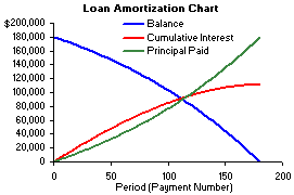
In the chart below, you'll see how the Balance decreases over time for a fixed-rate mortgage loan. The mirror image of the Balance is the Principal Paid. The scary thing is to see how much cumulative interest you have paid over time, as well. Notice how the Cumulative interest levels off as you get close to paying off a loan?
I mentioned above that amortization charts can be useful for comparing different loans. For example, in the Home Mortgage Calculator, I've created a chart that lets you compare the Balance with and without making extra payments.
Instead of two different balances on a single graph, you can also compare different loans by making modifications within a spreadsheet and watching the chart as it changes. You can do this with many online calculators as well. However, one very important thing about comparing charts dynamically like this is that the scale of the X and Y axes need to remain the same as you change the loan amount, interest rate, etc. In Excel, you can set the x and Y axes to fixed scales by right-clicking on the X or Y axis and selecting Format Axis. In the Scale tab, you'll find boxes that let you set the minimum and maximum values for the scale.
Simple Amortization Chart
for Excel
Download
⤓ Excel (.xlsx)License: Personal Use (not for distribution or resale)
"No installation, no macros - just a simple spreadsheet" - by Jon Wittwer
Description
Use this basic amortization spreadsheet to see how to create an amortization and payment chart in Excel.
This file is intended for educational purposes only. My loan amortization schedule and mortgage calculator are much more useful for use in evaluating and tracking real loans and mortgages.
Creating an Amortization Chart
One of the tricks to creating a chart like this in Excel is knowing what type of chart to use, and how to make it work for a variable length amortization table. I'm not going into detail, but I'll give you the 2 tips that you'll need. If you want to see how they work, take a look at the above spreadsheet.
- Use an X-Y (Scatter) Chart. This doesn't let you create bar graphs (without some fancy error bar tricks), but bar graphs waste a lot of ink so I try to avoid them anyway.
- For the X-axis, use the NA() function to avoid displaying the portion of the range after the last payment. You'll see how this works if you take a look at the Period column in the template.
There is another trick which I use in a lot of my mortgage calculators. However, it is more complicated, and designed to make it hard to figure out what is going on. It involves creating dynamic named ranges and using the named ranges for the series in the chart. This technique is not as compatible with other spreadsheet software, though.
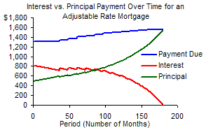
Interest vs. Principal Payment Chart
Another useful amortization chart shows the interest vs. principal payment over time. This is particularly useful when looking at an adjustable rate mortgage (ARM). You'll see in the chart below for a 3/1 ARM that the total payment due starts increasing each year after the initial 3-year fixed period. The red and blue lines represent the interest and principal portions of that payment, respectively. This chart was created using the ARM Calculator spreadsheet.