A calendar heat map is a type of calendar chart that uses color gradients to show how a data set varies over days, weeks, and months of the year. If you do an image search for the phrase "calendar heat map" you will find a lot of interesting examples. The example below comes from the javascript-based Google Chart API.
An example from the Google Chart API reference.
Even though this type of chart is not yet a built-in chart type in Microsoft Excel®, you CAN do this with Excel. And, it's not that difficult. You just need to have your data organized in a calendar format and then use conditional formatting to create the color scale.
I created a Calendar Heat Map Template for Excel to demonstrate how this can be done. You can go to that page to learn how to use the template. The purpose of this post is to answer some of the questions about how it was created.
First, let's talk about when you might want to use a calendar heat map instead of something simple like a line chart.
This Page (contents):
Why Use a Calendar Chart?
Calendar charts are useful for showing how data varies with the day of the week (i.e. Sunday, Monday, etc.). They may also be useful for seeing correlations with holidays and events.
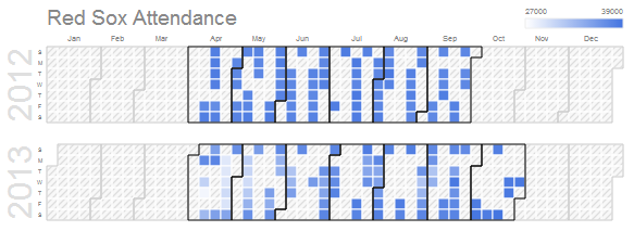
Consider the following example. The chart below shows one of the web traffic metrics for a site catering to small businesses.

In this chart you can easily see a correlation to the day of the week. Sunday and Saturday are the low traffic days.
If you look even closer, you can see some low points on days like July 4th, Christmas, and Thanksgiving - some of the common non-working days in the United States. Analyzing web metrics specific to a certain geography would probably show similar trends - where low traffic days correspond to that country's non-working days.
How Do You Do This in Excel?
I'm not going to explain step-by-step how to create a heat map in Excel, because you can download the template and figure out how it works. However, I will explain a few things.
First, take a look at the 1-Year worksheet. If you unhide all of the columns in the 4-Year worksheet, you'll find that the above example was created using the same approach.
On the left side is a regular calendar, with each of the cells containing date values that are just formatted to display the day only. The important point is that these cells contain real date values so that they can be used in lookup functions and conditional formatting rules.
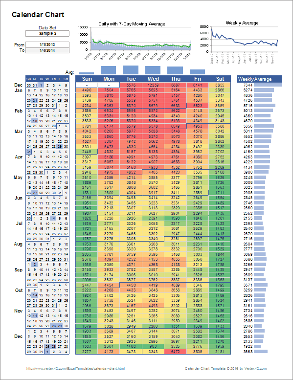
The calendar chart in the middle shows the values for each date. These values are stored in a separate Data worksheet, as shown in the image below. The values are displayed by looking up the value from the Data worksheet that corresponds to the date in the reference calendar on the left.

The Data worksheet in the Calendar Heat Map Template
The lookup function doesn't have to be complicated if you are creating your own heat map from scratch. A simple INDEX(MATCH()) formula could do the trick. But, the template uses the INDIRECT() function so you can choose which column of data you want from the Data set drop-down box at the top of the worksheet. It also allows you to choose whether to display "-" or a zero for missing data.
Multiple Data Sets Side-by-Side
The reviewer of this blog post suggested that the 4-Year worksheet might be useful for showing different data sets side-by-side. So, that is how the new "Multiple" worksheet in the template came to be. You'll see in the screenshot below that each of the 4 calendar charts can show different data sets, different starting dates, and different conditional formatting rules.
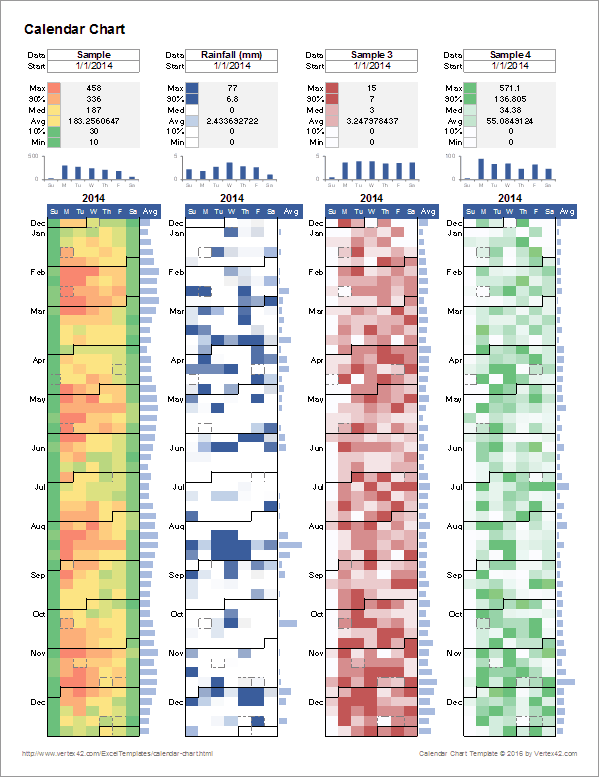
The summary stats section at the top includes the 90th and 10th percentiles to help you decide how you want to adjust heat map scaling. In the above example, the first chart uses the Max and Min for the color gradient. The other 3 charts use the 90th percentile for the darkest color and the Minimum value for the white color. I'm a fan of using percentiles for color gradients so that outliers don't skew the gradient too much.
One thing you can do with the side-by-side heat maps is analyze the same data set using different color gradients. Seeing the same data presented in multiple ways may help you figure out what you like best.
Correlation Between Data Sets
Compared to line charts, correlation between data sets may not be as easy to see with side-by-side heat maps.
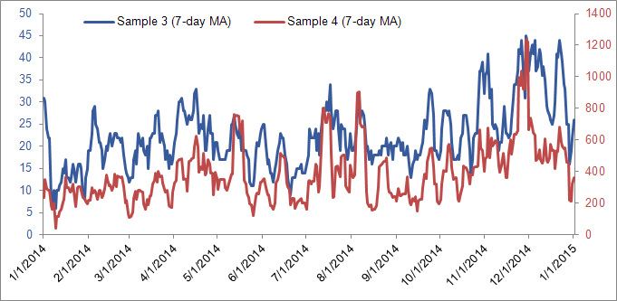
In the example above, I purposefully designed Sample 3 and Sample 4 to have a high degree of correlation: CORREL(AU21:BA73,BM21:BS73)=0.65. Can you see the correlation between the side-by-side heat maps? Maybe.
In contrast, the line chart below shows the 7-day moving averages for this same sample data. In my opinion, you can see the correlation between the data sets more easily using the line charts.
More Q & A
Q. In the 4-Year heat map example, why aren't the cells displaying numbers?
The numbers ARE there, but I'm just using a formatting trick to prevent them from being displayed. For anything other than small integers, numbers don't fit within the small space, so I used a custom number format of " " so that the cells do not display anything.
Want to see the numbers? Select a cell and press CTRL+~ to quickly change the format to the General format.
Q. Why are colors for the Summary Stats in the 4-year example not changing color when I define my own conditional formatting rule?
To provide a scale, the top of the 4-year heat map example contain cells that calculate the maximum, minimum, median, and average from the values displayed in the calendar. These cells need to be included in the "Applies To" range if you are defining your own rules. Go to Home > Conditional Formatting > Manage Rules to see what I mean by the "Applies To" range.
Q. How are the bar graphs above the calendar chart created?
In the 4-Year and 1-Year worksheets, these are column sparklines, a feature introduced in Excel 2010.
The cells that display the sparkline use a formula to calculate the AVERAGE of the values for each separate day of the week.
The source and location for the sparkline are the 7 cells containing these averages. To prevent the values in these cells from being displayed over the top of the sparkline, I used a custom number format of " ".
To make sure that all the sparklines use the same vertical axis scaling in the 4-year example, the entire range of averages spanning all 4 years is a single sparkline range. If you are doing this yourself, make sure to choose the option "Same for All Sparklines" in the Vertical Axis options for both the Minimum and Maximum values.
In the Multiple data set example, I didn't use sparklines because they don't show the scale of the vertical axis. Instead, I used small column charts so that the vertical axis could be shown and there would not be an assumption made that all 4 data sets were to the same scale.
Q. How are the cell borders that depict the different months created?
Cell borders are one of the things you can modify with conditional formatting (though you have more limited options than if you manually modify borders). I used 3 different conditional formatting rules to add a left/right/bottom border if the month of adjacent cells is different.
Q. How is the bar chart to the right of the heat map created?
Each cell uses the AVERAGE() function to calculate the average for that row of values. You can then select the column of averages and create the bars as a conditional formatting rule. By default, the numbers will be displayed with the bars, but if you edit the rule you will see an option to display the bars only (so using the " " custom number format trick is not necessary).
Q. Why can't you display both the calendar date AND the data within the same chart?
You can, but with this template I was trying to recreate something similar to the heat maps generated by the Google chart tool. If you want to show both the data and the calendar days within the same calendar chart, check out the template by Rob Collie of PowerPivotPro.com that uses Pivot Tables and Slicers (check out his article). It's pretty awesome.
Q. Can you use a calendar chart to show more than one data set at a time within the same calendar?
Sure, but that isn't how I designed this heat map template. I first started working on this after somebody asked me how to use my continuous monthly calendar to track multiple daily production metrics. Both that template as well as the planning calendar could be used to display more than one numeric value per day. That could be useful, but you would need to use different color gradients for the different data sets.
If you want to compare two data sets, a line chart may be the best way to go. Or, you could create a 3rd column in the Data worksheet that subtracts the values in the 1st and 2nd column. You could then show column 3 (the difference) in the calendar map.
Q. Why don't you just enter the numbers manually into the calendar instead of entering them in a separate worksheet?
You CAN track data by entering values into a calendar. However, it is a LOT easier to analyze your data using different types of charts if your data is tabulated using a column for Dates and a column for the corresponding Values.
Questions? Comments?
Please leave a comment below if you have questions or comments about the heat map template ... or just want to comment on the concept of using a calendar chart in general.


Comments
Very, very useful to us!
I’m trying to use your calendar so I can show my boss my attendance records. Can you help? I just keep date and hours/minutes missed in excel. See below. I can’t figure out how to interest it into your calendar. Please help. It would be greatly appreciated.
DATE HOURS
4/19/2018 3
4/20/2018 8
…
1/18/2019 8
@Brandi, You would enter your data into the Data worksheet (into the Date and Sample columns – you can change the “Sample” label to “Hours”) then update the From/To dates in the 4-Year or 1-Year worksheets. You may need to send your file if you can’t get it to work (too difficult to diagnose the problem, otherwise).
Very usefull file . Well Done
If there is no data for given day, how does it not display anything for that day on the chart?