Would you rather wade through a table of data or look at charts? You'll probably say charts, maybe because they help you see data trends and interpret numbers more easily. Now let's consider the feature in Excel known as Sparklines.
Sparklines are small, simple charts that are easy to make, easy to understand, and small enough to fit in a single cell alongside your data. Edward Tufte defines sparklines in his book, Beautiful Evidence: "Sparklines are data-intense, design-simple, word-sized graphics."
Sparklines are different from other Excel charts because they are smaller, don't have labels, and show only one line of data. If you want to, you can make a sparkline with Insert > Chart and take the time to shrink the new chart, re-size the axes, and get rid of all labels. But that takes a lot of time and can be tricky to get the graphs just the way you want them. Inserting a sparkline using the new Insert > Sparklines feature in Excel 2010+ is much easier.
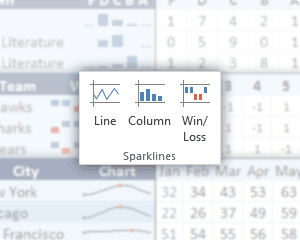
Excel 2010+ provides 3 types of sparklines: Line, Column, and Win/Loss. We'll show examples of each of these.
Sparkline Type 1: Line
Line sparklines help you see data trends and answer questions like these: How much does my data fluctuate? Does it trend upward or downward? What are the high and low points? Here is an example with temperature data for a few cities (sample data from weatherbase.com).
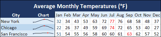
Example of a sparkline showing monthly temperature with the high and low points marked.
When you compare sparklines to each other, it is often very important to use the same vertical axis (meaning the same min and max values). To do that, select the sparklines and go to Design > Axis > Same for all Sparklines. If you want all the lines on the same chart, you should use a chart instead of a sparkline.
Each of the sparklines in the example above use the same min and max values for the vertical axis. So, you can see right away that the temperature in Chicago varies more during a year than San Francisco.
Sparkline Type 2: Column
Column sparklines are small column graphs that are great for comparing discrete groups of data. The table below shows the grade distribution for students' exams, with a different sparkline for each exam. Compare these sparklines to the table of data on the right. Do the sparklines help you understand the data better?
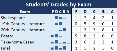
Example of column sparklines showing the grade distribution for each exam.
Sparkline Type 3: Win/Loss
Win/Loss sparklines are similar to column sparklines except that they don't show size. They show only a bar above, a bar below, or no bar at all. All bars are the same height regardless of the value. Win/Loss charts are great for binary data such as True/False, OK/Issue, or Win/Loss. The example below shows season wins for different teams.
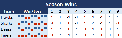
Example of sparklines showing win/loss records.
How to Create a Sparkline in Excel 2010+
To create sparklines, you start with a table of numerical data, just like you would with any other chart. If you want to chart the average monthly temperature in different cities, create a table of the average temperature each month for each city. Then select just the cells with temperature data, not the cells listing the months or the cities. Go to the Insert tab. In the Sparklines group, choose one of the 3 types (Line, Column, or Win/Loss). The Create Sparklines dialog box will appear, asking you to choose a location for the sparklines. Pick a range that is the same number of rows as your data. (Unless you want to chart columns instead of rows. Then the range should be the same number of columns as your data).
To edit a sparkline, click on it and choose the Design tab on the ribbon. You have several customization options here. One is to mark some of the points, such as the highest and lowest values.
To delete a sparkline, you can not just select it and push the delete key. Instead, once you've selected the sparkline, you'll need to go to the Design tab on the ribbon and click Clear.
That's all you need to know to get started using sparklines. There are many more applications for sparklines. Be creative! They're easy enough to add that it's worth experimenting to see if a sparkline will help you analyze your data.
References
See Vertex42's original article on Sparklines from 2006.
This Blog Article from Microsoft Office explains how to insert and edit sparklines.
About the Author
At the time of publication, Laura Cutler was an Excel specialist and freelance writer. She is now an Assistant Teaching Professor at BYU in the Information Systems department.


Comments