By guest author, Kasper Langmann, from Spreadsheeto.com.
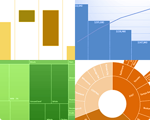
Microsoft Excel 2016 has brought us six new built-in chart types: Waterfall, Histogram, Pareto, Box & Whisker, Treemap, and Sunburst. The addition of these new charts is largely due to user feedback and requests.
This Page (contents):
Each of these has its own special scenario-based application, but they all take data visualization to a far more professional level than the typical bar, line and pie charts that have become ubiquitous in data analysis. Prior to Excel 2016, the creation of these charts was either impossible without an add-in or required using Excel tricks developed by experts over the years. Now they can be created, modified and customized just like the other built-in charts.
To get the most out of this guide, try the new charts out for yourself by downloading the exercise file below.
Download the exercise file here
#1 - The Waterfall Chart
The waterfall chart provides a great method to visualize the impact of multiple data points (typically a series of positive and negative values) as a running total. This is common when analyzing financial data like what would be found in an income statement. But the waterfall chart is generally useful for visualizing data over time to see where you started versus where you are currently and how you got there.
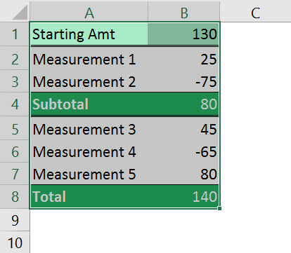
Let's take a look at a generic data set that includes and initial starting amount with various measurements that add and subtract from that amount. The data also has a subtotal along the way along with a final 'Total' value. To create a waterfall chart from this data, we first need to highlight the entire data table.
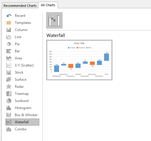
Then from the 'Charts' section of the 'Insert' tab, go to the 'All Charts' tab and select 'Waterfall'.
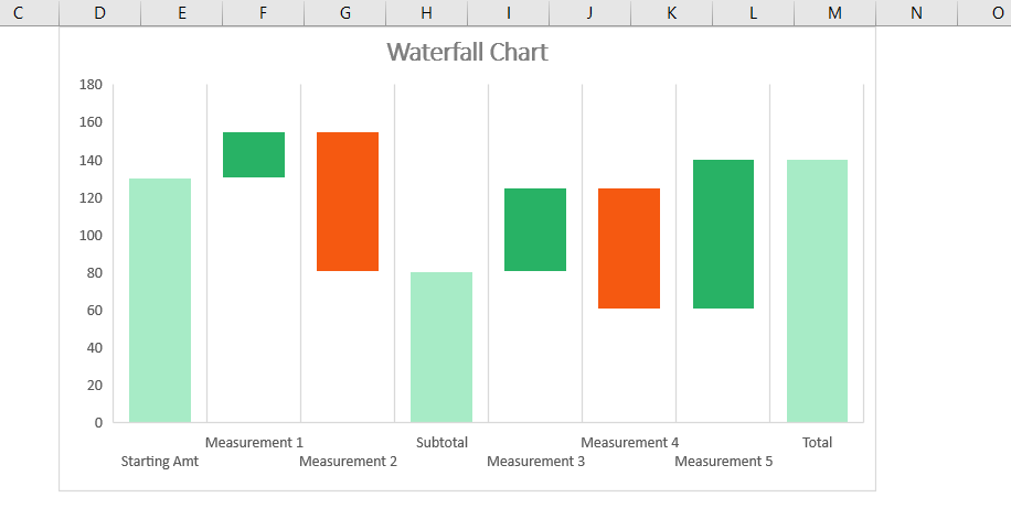
The resulting chart can then be formatted a variety of ways to fit your needs. In our example, we have used dark green for positive measurement values and orange for negative.
Pay particularly close attention to the start point and end point of each successive bar. The waterfall effect is reflected in the rise of the dark green bars and fall of the orange bars. The waterfall chart is a very effective way to visualize time series data involving the addition and subtraction of amounts.
Note the all of these charts can be customized by accessing the 'Design' and 'Format' tabs in the 'Chart Tools' section of the ribbon. In order for the 'Chart Tools' to appear, click on any part of the chart.
(See also: Waterfall Chart Template for Excel)
#2 - The Histogram Chart
A histogram chart is another variation of the bar chart like the waterfall but instead shows the frequency of data. It does this by showing data as a range of values or 'bin'. We looked at a very generic generalized example to illustrate the waterfall chart but let's dig into a more specific scenario with the histogram.
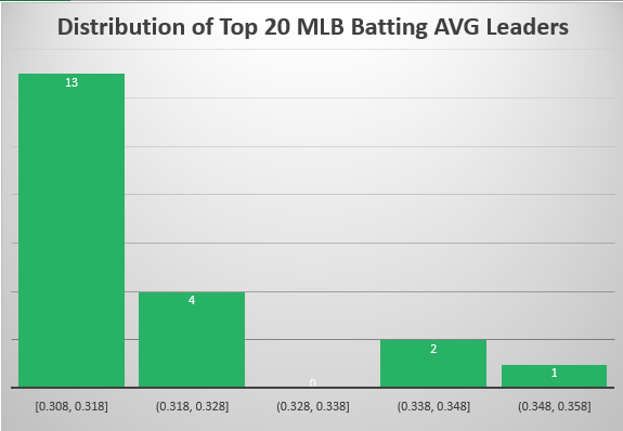
Let's consider the top 20 players in MLB by batting average. Our objective is to separate out the frequency of players within 'bins' that span the range from lowest batting average to the highest.
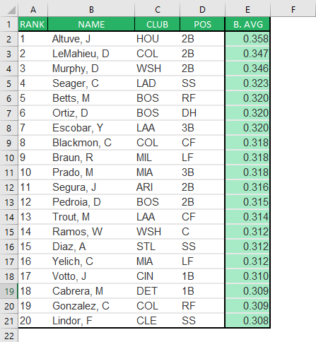
Notice that the lowest average of the top 20 players is .308 while the highest is .358. It follows that the total range is 50 points. This would fit quite nicely into 5 bins of 10 points each. Doing so will allow us to visualize the number of players within each 10 point range and see the distribution of the top 20 players across those ranges.
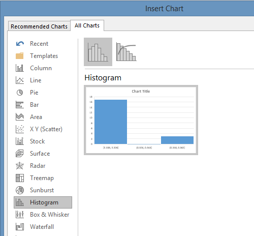
The first thing we need to do is simply highlight our entire table of data and follow the same steps we did with the waterfall chart except select 'Histogram' this time.
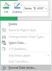
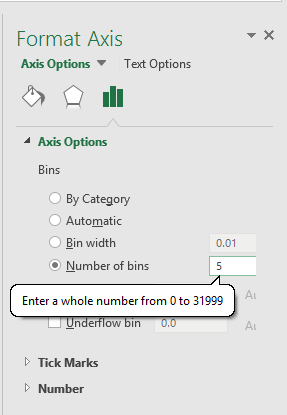
The next thing to do is to right click on the bars of the resulting chart and select 'Format Data Series'.
Then select 'Horizontal Category Axis' from the 'Series Options' drop-down.
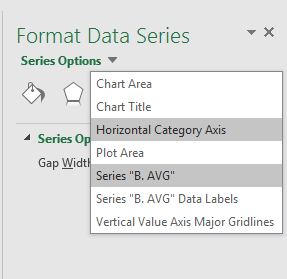
We can then select the number of 'bins', in our case 5. This will result in the following chart showing us the distribution of players across each 'bin' of 10 points from .308 all the way up to .358.
As the resulting histogram chart clearly shows, the greatest number of players that are in the top 20 actually have batting averages somewhere between .308 and .318. Only 3 of the 20 have a batting average .338 or higher.
(See also: Creating a Histogram in Excel)
#3 - The Pareto Chart
The Pareto Chart is another variation of the bar chart that mixes in a line chart. The bars of the chart represent data values in descending order while the line chart represents the progression of the cumulative percentage of the total.
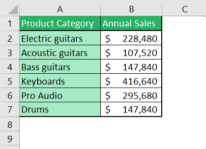
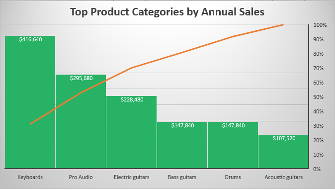
For example, let's say we want to look at the annual sales across different product categories for a music store chain. The Pareto chart will show us the dollar amounts in descending order by category while superimposing a line chart that traces the cumulative percentage of total sales from one category to the next.
Expand the 'Charts' section of the 'Insert' tab and on the 'Recommended Charts' tab select 'Pareto'.
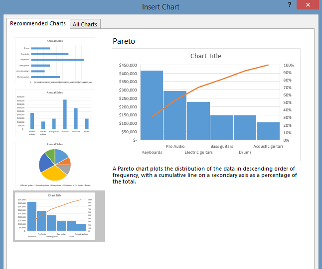
This puts our product categories in order from highest sales to lowest and shows us that the top 3 categories by sales volume were Keyboards, Pro Audio, and Electric Guitars. The chart also shows us that these 3 product categories make up almost 75% of total sales.
(See also: Pareto Chart Template for Excel)
#4 - The Box and Whisker Chart
The box and whisker chart is used in statistics to show the distribution of data into quartiles. The chart also highlights the mean and any outliers. The first quartile is indicated by the horizontal line on the lower whisker up to the bottom line of the box. The second quartile is from the lower line of the box to the meanwhile the 3rd quartile runs from the mean to the top of the box. The last quartile begins with the top of the box up to the length of the upper whisker. Any outliers are plotted as points above or below the length of either of the whiskers.
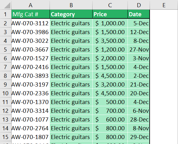
We can use single or multiple data series with box and whisker charts. To illustrate, we will look at individual sales data by purchase price for three different musical instrument product categories: electric guitars, keyboards, and pro audio. Our data table looks like the following:
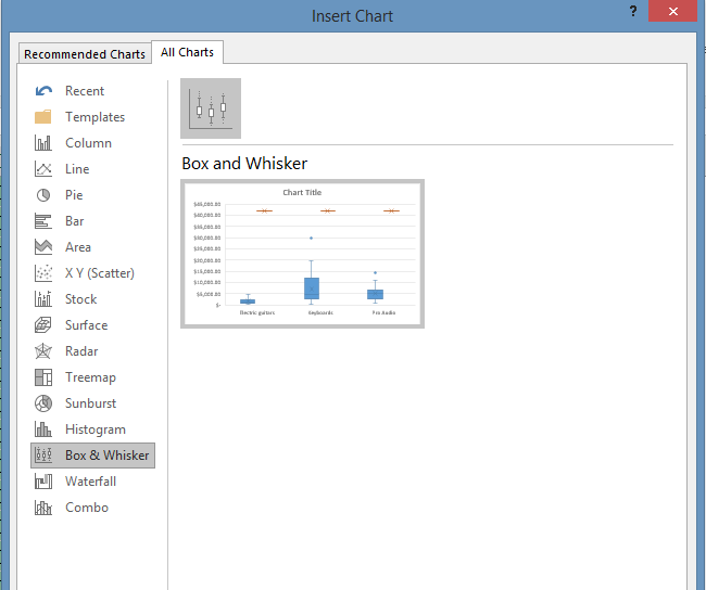
Again, we simply highlight our data table and follow the same method we have in the previous examples but this time selecting 'Box & Whisker' from the 'Insert Chart' dialog box.
In our example, the 'Box and Whisker' chart allows us to visualize the variation in price for the tree product categories as well as where details like the mean and any outliers fall in relation to that variation.
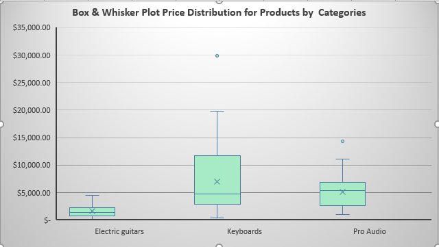
Note that the variation in price is quite wide for keyboards yet fairly narrow for electric guitars. Like the previous charts, this is another very powerful chart type for visualizing data that would otherwise be rather difficult by simply looking at the table of data itself. This is especially true when analyzing a very large data set.
(See also: Box & Whisker Chart template for Excel)
#5 - The Treemap
The treemap chart is one that visually represents data in a hierarchical fashion allowing for the recognition of patterns. The treemap chart represents data with rectangles sized by a value or quantity and it can also make use of different colors to represent different categories. Treemap charts are great for visualizing hierarchical data within categories as compared to other categories.
For example, let's consider a small grocery store that wants to visualize sales data across different grocery categories: Fruits, Vegetables, Nuts, Dairy, and Meats. Each of these categories has specific food products classified to them that we have quarterly sales data for.
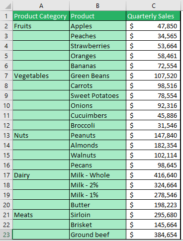
Notice that even though our data table is organized and sorted by product category, the fact that it isn't sorted by sales amount really doesn't give us a sense for which products have the best or worse sales volume or what kind of patterns are being established. At least not at-a-glance. A treemap chart can help us with this.
As before, we simply highlight our data table and select 'Treemap' from the 'All Charts' tab of the 'Insert Chart' dialog box. You should be pretty familiar with this part of the process at this point. The result is the following chart:
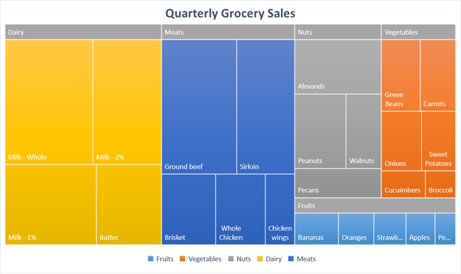
This chart is a bit more colorful than our previous examples and this is by design. Each product category has its own color for better differentiation. Notice also how the chart is not only organized largest to smallest in regards to product rectangles within each product category but also how each product category rectangle is organized in the same fashion.
Again, the treemap is a fantastic chart for providing a quick glance representation of data in hierarchical fashion within categories. Furthermore, as this example illustrates, it also provides additional visualization at the overall level.
Clearly, dairy is the sales volume leader at the category level. But we can also focus in on the nuts category to see that pecans have the lowest quarterly sales within that category.
#6 - The Sunburst Chart
The final new chart available in Excel 2016 that we are going to take a look at is the sunburst chart. This is yet another chart that provides a hierarchical visualization of our data. The sunburst map represents data in the form of concentric circles. When visualizing data that is organized into multiple levels of categories, the sunburst chart shows how outer rings relate to inner rings.
Let's look at home run totals within the American League where we have some data broken down to the player level with a few teams.
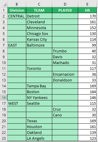
Notice that our table drills down to a few category levels: Division to team to player. So for those players with their home run stats parsed out of the totals, the sunburst chart will give us a final outer circle that identifies them with their team and the team with the division. Let's take a look at the chart:
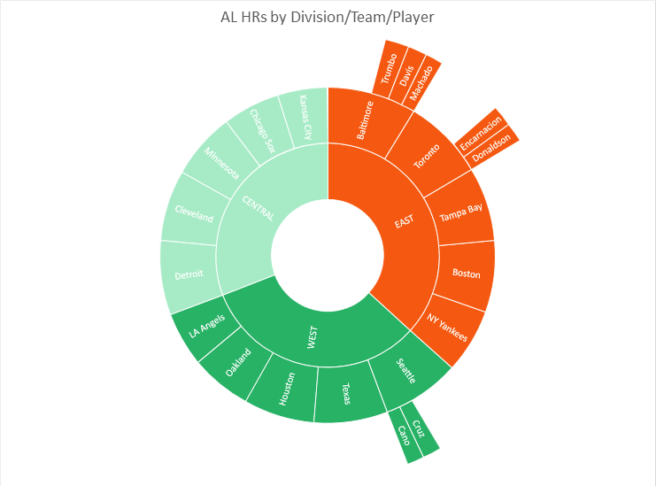
Note the size and relationships of the player boxes to their team box. Since each player only contributes a portion of the team total for home runs, the sunburst chart accurately represents this.
Compatibility Considerations
A note of caution when sharing your files containing your new brilliant charts in Excel 2016: they are not cross compatible with previous versions of Excel. If an Excel 2010 or 2013 user opens a file with the new Excel 2016 charts embedded, they will not only not see the actual chart but will instead see a warning:
"This chart isn't available in your version of Excel. Editing this shape or saving this workbook into a different file format will permanently break the chart."
The best workaround for this issue is to simply copy and paste the chart as an image into any file you intend to share with another user that does not have Excel 2016. It is as simple as clicking on the chart in question and going to Home > Copy > Copy as Picture. If you are pasting into another Office program (like Word or PowerPoint) then you can copy using Ctrl+c and then use Paste Special to Paste as a Picture.
This will allow other users with compatibility issues to view the charts but not see any dynamic changes if they make additions, deletions, or other changes to the source data.
Final Thoughts
There's little doubt that Microsoft has definitely hit it out of the park with these 6 new charts that have been released for Excel 2016 users. In direct response to user feedback, Microsoft has finally caught up to some of the greatest demands for data visualization. We've created an infographic that gives you a complete overview of the 6 new charts. Spend a bit of time learning more about each of these new charts and it won't be long before you begin to discover new and more opportunities to make use of them.


Comments
Wow!!!
Thanks for the detailed explanation. I did not know this type of graphics since I only have the 2010 version.
Informative and useful information of Excel chart with which chart where to fit with proper visualisation.
I was looking for a waterfall Template. Your one is perfect.
Just one point : I would like to switch columns / lines, and I can’t manage it. It seems looked.
How would it be possible ?
@Benoit, Not sure what you mean by switching columns / lines in my waterfall chart template. You’ll need to contact me via email and provide more details.
Wonderful write up.Thank you for sharing it.
Very good job on Waterfall chart template
Thanks for sharing – especially the sunburst diagram!
Is there a way to have labels aligned with the circumference rather than pointing towards the center?
Thank you.
@Tosh … I don’t see any formatting options in Excel 2016 for the sunburst diagram that allow you to change the alignment of the text. The really tedious and non-automated way to do it would be to remove the data labels and create all the labels using word art on top of the diagram.
how many types chart use in ms excel 2016.