By Onur Yilmaz of Someka.net, edited by Jon Wittwer
Data visualization is a trending topic in recent years as we collect and analyze more and more data. Geographic Heat Maps provide a very useful technique for visualizing data associated with countries, states, and cities.
If you have tried the Power Map feature in Excel, known now as 3D Maps in newer versions of Excel, you may have been amazed at how easy it is to create a heat map for standard geographic regions. If you delve even deeper, you can learn how to create heat maps for custom boundaries.
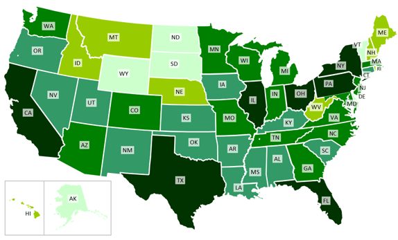
There may be times when you'd like to create a geographic heat map without being limited to the functionality of the built-in 3D Maps feature. In this article, we will share how you can do this with custom shapes, formulas, and a little bit of VBA code. The result is a great-looking heat map that looks like this:
In this article we will go over every step to create your own Geographic Heat Map Generator in Excel for USA states. After you get the idea, you can implement the same for other cities and countries or even situations where the shapes might not even be geographical.
If you don't have enough time to make one for yourself, you can take a look at the Ready-To-Use Heat Map Generators in Excel on Someka.net
Ok, let's get our hands dirty!
The development of this tool consists of 4 main parts:
- Create/Gather Visual Assets
- Set up the Data Table and Name Shapes
- Create the Legend and Color Scale
- Automate with VBA
1. Create/Gather Visual Assets
First, we will need to find, create, or import separate shapes for each of the states in the USA. A full USA map doesn't work for this task. The shapes should be free-form and editable.
You can Google "editable powerpoint USA map" or something similar. These shapes are generally provided in powerpoint templates. You can find both free and premium maps. (For example: http://www.presentationgo.com/presentation/usa-editable-powerpoint-map/) After you get the shapes, copy or insert them into a blank Excel workbook. The shapes may be grouped together, so don't forget to "Ungroup" the shapes after you get them into Excel.
An alternative is to draw the shapes yourself in Excel using Insert > Shapes > Freeform: Shape. If you insert an image of a map into Excel, you can use the image as an aid in tracing boundaries as you create the shapes. You could also use Photoshop, Illustrator or other image editing software. Drawing your own shapes will just take longer.
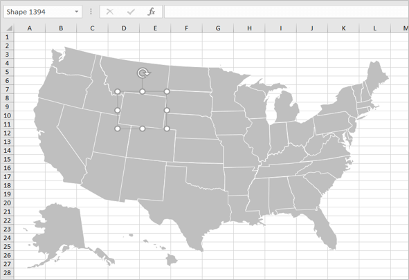
After you have the USA states inserted into Excel, editable and ready to be painted, try changing the fill color of a couple of the shapes one at a time to make sure that works.
You will have something similar to this:
2. Set up the Data Table and Name Shapes
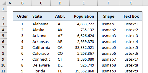
Create a data table similar to the one in the image below. It is important to include the "Order" column because we will use the number to link the data table to the shapes in the map.
The Shape and Text Box columns show the names that will be used for naming each of the shapes and textboxes in the next step.
Name each shape
Now we will need to "Name" each shape one by one. This is the most tedious part. We need to name these shapes because we will loop through them automatically with a VBA macro to change the fill color. It will take effort, but the results are rewarding.
• Select each shape (state) and name it using the name box to the left side of the formula bar. In the image of the shapes above, you can see that the selected shape is named "Shape 1394." Change that to the correct name found in the Shape column of the data table.
• Use a naming convention that is easy to loop through with VBA. For example: usmap1, usmap2, usmap3.
Create text boxes for each shape
• Create a text box (Insert > Shapes > Textbox) for each state and place the text box over each state (or for small states, place the text box nearby and use a leader line to point to the state). In the end you will have as many text boxes as your state shapes. Tip: Format the first text box the way you want (using whatever placeholder text you want), and then copy and paste the text box.
• Name the text boxes ustext1, ustext2, ustext3, etc. the same way you did for the states (select the textbox, use the Name Box to name it, etc.)
• The text box names should correspond with the state names as shown in the data table.
Creating and naming the shapes and text boxes is the most tedious part of this process. But, now you have 50 state shapes and 50 corresponding text boxes placed on each state. We are ready to proceed to the next part.
3. Create the Legend and Color Scale
Now we will define our legend and color scale and write formulas that our macro will use to update the colors and text values in the map.
Define your Legend
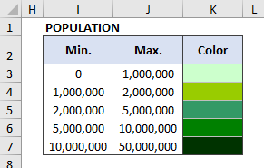
The legend is used to define the data ranges used for the color scale in the heat map. There isn't a limit to the number of divisions in your legend. However, using too many different colors may be confusing.
In this example, we will use the following 5 divisions for population in our legend:
Define the Color Scale
You can choose any color scheme you want, but it is common to use different shades of the same color (for a monochromatic color scale).
Important: After editing the fill color of the cells in your legend, name each of the cells color1, color2, etc. by selecting the cells in the Color column and using the Name Box to enter the names. If named properly, when you select cell K3, the name color1 should appear in the Name Box.
4. Automatically Update the Map Using a Macro
Before we create the VBA macro that updates our map, we will create a small helper table that the macro will use. We need to create formulas that will return the data value, text value, and color based on a chosen Order number.
The following image shows the helper table and the formulas that are used to return each of the values.
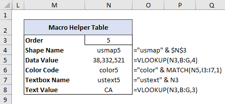
When you (or the macro) updates the Order # to 5, the formulas create the names of the shape and text boxes using text concatenation (&). The population and state abbreviations are grabbed from the data table using VLOOKUP. The color is determined using the MATCH function, which compares the data value to the Min values in the Legend.
Named cells make VBA macros more robust, so we will name the cells in our helper table as follows: N3:actorder, N4:actstate, N5:actstatevalue, N6:actcolorcode, N7:acttext, N8:acttextvalue.
After creating your helper table, manually change the number in the Order cell to make sure the formulas are working properly.
Create the Macro
Now we are finally ready to create the macro that will automatically loop through each shape and text box to update our heat map.
To create the macro, open the VBA window (Alt+F11) and insert a module and copy/paste the following code into the module. If you aren't familiar with how to create a macro using VBA, then you may want to review the article Create a Macro at support.office.com. You can use the macro recorder to record a macro named "Paint" which might just involve selecting a cell in the spreadsheet. You can then open the VBA editor to replace the code in your recorded macro with the following.
Sub Paint()
  Dim i As Integer
  For i = 1 To 7
    'First, paint the state shapes
    Range("actorder").Value = i
    ActiveSheet.Shapes(Range("actstate").Value).Fill.ForeColor.RGB = _
    Range(Range("actcolorcode").Value).Interior.Color

    'Second, update the text boxes
    ActiveSheet.Shapes(Range("acttext").Value).Select
    Selection.Text = Range("acttextvalue").Value

    '(Optional) Format the text boxes
    Selection.ShapeRange.Fill.ForeColor.RGB = RGB(255, 255, 255)
    Selection.ShapeRange.Fill.Transparency = 0.3
    Selection.ShapeRange.TextFrame2.TextRange.Font.Fill.ForeColor.RGB = RGB(0, 0, 0)
    Selection.ShapeRange.TextFrame2.TextRange.Font.Shadow.Visible = False
    Selection.ShapeRange.TextFrame2.MarginLeft = 2.5
    Selection.ShapeRange.TextFrame2.MarginRight = 2.5
  Next i
  ActiveSheet.Range("pntOrder").Select
End Sub
Add a Button to run the "Paint" macro
In the Developer tab, go to Insert > Button. When prompted to assign a macro to the button, choose the "Paint" macro you just created.
If you are lucky, the macro will work perfectly the first time. If it doesn't work the first time and the debug tool doesn't help, check that all of the cells referenced in the macro are named correctly (including the color1, color2 ... cells).
Remember, if you run into problems or you don't want to spend time creating your own heat map generator, you can get a ready-to-use USA Geographic Heat Map Generator Template via Someka.net.
Geographic heat maps are great tools to visualize country/state data. You can use them in your presentations, reports and they look really cool! You are not limited to just USA maps. With the same logic explained above you can build different geo heat maps for other countries as well.
Author Bio: Onur Yilmaz
 Onur Yilmaz hosts the website Someka.net and has a background in engineering and finance. He specializes in template design and was the Turkey Excel Champion in 2016.
Editor Comments (by Jon Wittwer)
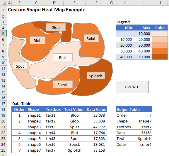
In the process of editing this guest post by Onur, I created a very simple generic example using custom shapes. The point was to show that you don't need to be limited to standard geographic boundaries. Although this post requires some intermediate Excel knowledge, I was very pleased with how simple it was to create my own heat map using Onur's process.
If you'd like to analyze the example file, you can download the file I created below.


Comments
Thank you for this tutorial. Its very informative and useful!
Thank you so much for your great instruction. I would like to ask you if there is any way to further extend this heat map to give more color options. My visualization is that you could have a text box. You would be able to type for example 6 color. Then you would be able to decide the 6 colors of your choice and fill the map within your range of choice. Or you can make 3 colors, 4 colors and the table will just automatically create these things. I need it for my work when not everyone know how to edit a VBA
@Huan, To define different colors, all you need to do is edit the fill color within the Legend by formatting the cells. I suppose you could add macros to change the colors in the legend based on a choice within a text box, but it’s pretty easy to just edit the color using basic cell formatting.
Thank you for your instruction. I am however, a little bit stuck. I have hoping to create a “heat map” of a car blueprint, not a location. I have separated the image into 24 (the number of locations I need) images, named them all, created a colour scale. I have however come to a stand still of how to create the macro from here. Is it possible, do you have any advise for me? Thank you.
@Lauren, Sounds like the bulk of the work is done. You just need to follow the steps outline in step 4 (“Automatically Update the Map Using a Macro”). Download my example file (the one with the orange blobs) to look at how I set that one up. If you then have specific questions or problems, let us know.
Hi, thank you for this tutorial. I have the following problem: when I try to run the macro it doesn’t work and has a problem with this line: “Range(“actorder”).Value = i” any idea why?
thanks
@Mel … Check the Named Manager to see if the range “actorder” has workbook scope. If it has worksheet scope, try using ActiveSheet.Range(“actorder”).Value = i
Thanks it worked! Another question- do you think it would be possible to do this with 600+ shapes or would it crash Excel?
@Mel … I don’t see why it would crash, but it could sure take a while to name that many shapes.
Hello,
Very good explanation.
however I am stuck. I’ve done everything step by step and still get a error when I run and get
“Method ‘Range’ of ‘_Global’ failed”
when I open debug it says “Range(“actorder”).Value = i” I tried what you mentined above and changed the code to “ActiveSheet” but still remains yellow !
could you please help this is very important to me !
thank you
Sal.
@Sal, Short answer: I don’t know. If you emailed the file I may be able to figure out, but I can’t tell what’s going on just from the blog comment.
Range(“actorder”) is a cell reference in the workbook. If you started this tutorial with a fresh new workbook. You would get this error cause you very likely didn’t name any cell in your workbook “actorder”.
The author has a link to a workbook (the last graph workbook that is in his article). It should tell you where that cell reference is.
But if you’re trying to make the map work. You have to edit the macro a bit. I won’t get into it here because the author does reference his own website where he sells his map tool. But if you’re familiar with VBA you get the idea of what’s being done and can modify it to your needs.
Thank you for this step by step guide. Very cool! What additional steps and code would be required to dynamically change the font color based on cell value?
Thanks a lot, you’re GREAT!
Thanks for this post. Very useful.
I’m running into a problem when I try to run the macro I get an error at:
Range(Range(“actcolorcode”).Value).Interior.Color
Any idea what the problem could be?
Many thanks!
@Martina … Try looking through the other comments – might be a similar issue to others. Check the scope of the named range “actcolorcode” and you might need to use ActiveSheet.Range… or something like that. You might try requesting a quote from an Excel consultant to help you.
Fantastic, thank you! I’ve done two of these now. Added selection boxes, keys that change color based on selection, data displayed on the side. Even did a “bubble-style” on one. You can really go wild with it.
Hello – this was so helpful but it seems I’m stuck/getting an error on the last line:
ActiveSheet.Range(“pntOrder”).Select
I’m pretty new to this so any help would be appreciated!
The text boxes come in with a colored box around the text. Any way to eliminate this? I can do it individually but when I run macro they appear again. Thanks
I got it. Change transparency in macro to 1.0.