Timeline Template - How to Create a Timeline
in Excel
There are many ways to create a timeline in Excel. Some methods use drawing tools or bar charts, as in my other timeline examples. Another popular method, especially for project timelines, is to use a gantt chart. This page descibes a method that I developed to create timelines quickly in Excel using an XY scatter chart with events as the data labels. Continue reading below to learn how to create the timeline from scratch, or save time by purchasing the timeline template.
The technique explained on this page is particularly useful for creating historical timelines and project timelines, as well as genealogical timelines that highlight events in a person's life. The first example shown below was created using the first version of my Excel Timeline Template back in 2005.
If you are using a more recent version of Excel (Excel 2013 or later), then you may want to try the newer timeline template.
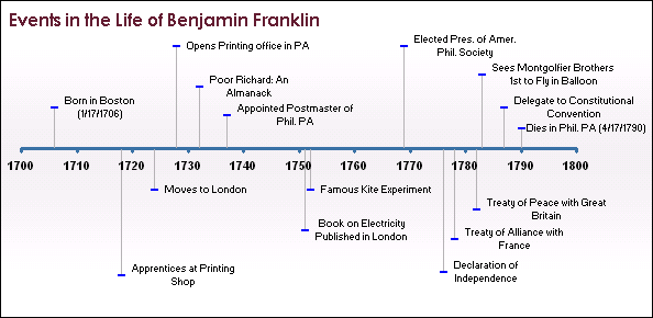
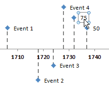
Figure 1: An Excel chart showing an example timeline.
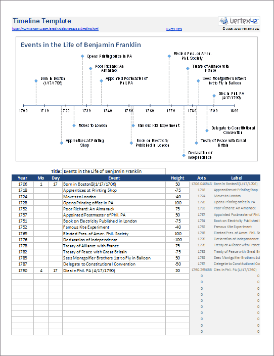
The template has improved over time through feedback from many users. You can still make very simple timelines like the one above. But, with a little formatting and some images, you can make your timeline look much more interesting. You can insert images into Excel charts as well as format a data point marker so that it displays an image. That is what I did to create the new example timeline shown below.
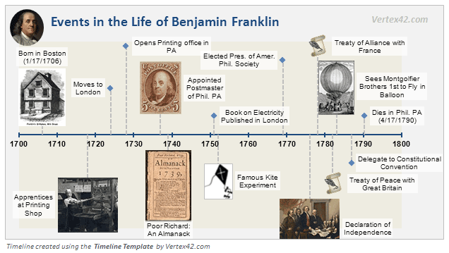
Figure 2: Timeline with images and a little formatting.
If you want to start creating your own timelines right away, you can download the Excel timeline template. If you are more worried about your budget than your time, you can create your own timeline chart from scratch using the instructions in the "how to" section below.
Excel Timeline Template
via ClickBank.net
License: Private Use
(not for distribution or resale)
Support: Visit Support Page
60-DAY MONEY-BACK Guarantee
 Try it out! If you don't think it was worth the cost, I will refund your purchase.
If you are using Excel 2013 or later, you may want try one of my new free timeline templates: (1) Project Timeline, (2) Vertical Timeline, (3) Bubble Chart Timeline.
Note: Timelines are easier to create in Excel 2013 or later because of the new chart feature that lets you select a range of cells to use for the Data Labels.
Description
"Having not used Excel for any function more complicated than cataloguing in the longest while, this was just what was needed - no nonsense, quick to set-up, to the point. Highly recommended." - E
"Thanks, just what I was looking for - easy when you know how. Instructions great for those of us who refuse to upgrade to the clunky chart drawing in new versions of Excel!" - shepwill
"This how to and accompanying worksheet are exactly what I needed. Thank you very much." - Lance O'Neill
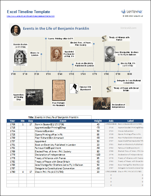
Begin creating timelines in Excel within minutes by purchasing the Excel Timeline Template. We've set up the data tables and Excel charts for you, so you enter the Dates and event descriptions and adjust the heights of the lines to get things to fit the way you want.
There are no hidden formulas, no hidden worksheets, no macros, and no VBA. You can change the colors and formats of the chart elements however you want, limited only by what Excel allows you to do.
Historical Timelines - The primary purpose of this template is to help you create historical timelines, such as events in a person's life or perhaps the history of a company or organization. These timelines use a year-based axis as shown in the Benjamin Franklin examples above. You can adjust the axis scaling like you would any other Excel chart.
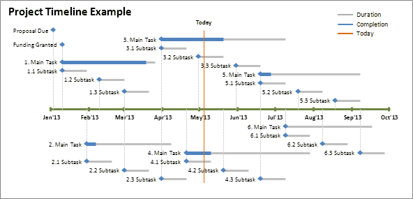
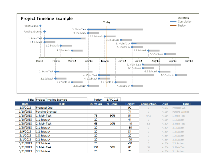
Project Timelines - The spreadsheet includes two project timeline worksheets, where events can show both duration and completion status. See screenshot #3 above. You can choose either the day-based axis (the labels are dates) or the year-based axis (the labels are years).
You will also be able to download a separate project timeline file in which the axis is date-based as explained in the section "Using a Date-Based Axis" below.
Adding Images - The Benjamin Franklin example is included in the spreadsheet, with instructions explaining how to insert images into your timeline. You will need to find and edit your own images.
Feedback - We are interested in your feedback. Please see our about/contact page (the link in the top-right corner of this page) to send us comments or questions about this template.
Number of Events - The template lets you enter up to 100 events. It is possible to add more, but that is not a simple procedure and would require following some of the instructions below. Also, the more events you want to show in a timeline, the more difficult it will be to avoid having labels overlap.

How to Create a Timeline in Excel
The following instructions have been updated for Excel 2010. You can use these instructions to create your own timeline in Excel from scratch, if you don't feel like purchasing the template.
Set Up the Data Table for the Time Line
- Set up your timeline data table as shown in Figure 3 below.
- The Year, Mo (month), Day, Event, and Height columns are the inputs. It is very important that the Year be in ascending order at first. You can leave the Month and Day fields blank for now.
- The Axis column will be used as the horizontal time line axis. We want to be able to handle dates prior to 1900, so we calculate a decimal year. The formula for cell F31 is:
=A31+(DATE(1900,IF(B31="",1,B31),0)+C31)/365.25
or if you want the table to be more robust to copy/paste, cut/paste, and sorting, use:=OFFSET($A$30,ROW()-ROW($A$30),0,1,1)
+ ( DATE(1900,IF(OFFSET($B$30,ROW()-ROW($B$30),0,1,1)="", 1,
OFFSET($B$30,ROW()-ROW($B$30),0,1,1)),0)
+ OFFSET($C$30,ROW()-ROW($C$30),0,1,1) ) / 365.25 - Column G is just referencing column D, but we use the OFFSET formula so that we can copy/paste and cut/paste within columns A through E without messing up the timeline. The formula for cell G31 is:
=OFFSET($D$30,ROW()-ROW($G$30),0,1,1)
- Copy the formulas in F31 and G31 down.
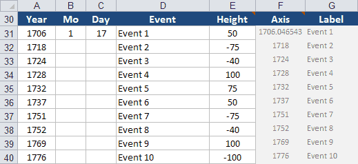
Figure 3: Data table used for creating the timeline chart.
Create the Timeline Chart
The next step is to create a Scatter Chart with the Height values as the Y-axis (vertical axis) and the Axis values as the X-axis (horizontal axis).
- Select cell E31:E40 (the Height values).
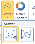
- Go to Insert > Charts > Scatter and choose the chart type shown in the image on the right.
- New Chart Tools contextual tabs will show up with the chart is selected. We need to add the X-axis values, so go to the Design tab and click the Select Data button (or right-click on the chart and choose Select Data).
- In the Select Data Source dialog box for Series1, click the Edit button, and in the "Series X values" field, choose cells $F$31:$F$40 and press OK.
- You can now clean up the chart by going to the Layout tab and turning OFF the legend, gridlines, and vertical axis.
- Go to Layout > Data Labels > Right to turn ON the data labels (they will be just numbers for now).
Add the Leader Lines
We're going to create leader lines for the timeline by adding vertical error bars to the data series.
- Select the data series by clicking on one of the data point.
- Go to Layout > Error Bars > More Error Bar Options.
- In the Vertical Error Bars tab, select the Minus direction, the No Cap end style, and set the Percentage to 100% then press Close. You may also want to go to the Line Color or Line Style tabs to make the leader line a dashed gray line.
- We want to turn off the horizontal error bars, so go to the Layout tab and select "Series 1 X Error Bars" from the drop-down list in the "Current Selection" group. Then click on "Format Selection" right below that drop-down box. Set the end style to "No Cap" and set the "Fixed value to 0", then press Close.
Add the Timeline Event Labels
Prior to Excel 2013, the data labels need to be edited one at a time to link them to the Labels column in the data table. This is tedious and tricky to set up the first time. Here is the process:
- Select the first Data Label and then click on that Data Label one more time. The first time you select a data label, ALL the data labels are selected. The second time you click on a data label just that ONE data label is selected.
- With a single data label selected, click inside of the Formula Bar and press the = key.
- Click on cell G31 and press Enter.
- Select the next data label (Tip: press the Right Arrow key →) and repeat steps 3 and 4 to reference the next cell in the Label column (G32, G33, etc.).
- Repeat the previous step until all of the data labels have been linked to the corresponding cell in the Labels column.
Tip: In Step 3 you can type the reference if you know what it should be. Using copy/paste and editing the row number in the reference may be faster than using the mouse to select the correct cell.
For Excel 2013 or later: You can use the Value From Cells option when editing the data labels to link the data labels to the Labels column, instead of using the technique of linking one data label at a time. Watch the video on the Vertical Timeline page to learn how to do that.
Customize the X-Axis Date Range and Format
Sometimes you may want to set the x-axis to display a specific year range, such as 1700 to 1900 with 50-year intervals between the axis labels.
- Right-click on the x-axis and select "Format Axis..."
- In the Format Axis dialog box, go to Axis Options and edit the Minimum and Maximum values. Edit the Major unit value to control the interval between the axis labels.
For a date range as far back as BC, you can enter negative values in the Year column and you can create a custom number format for the x-axis that will display years as "15,000 BC" or "2,000 AD"
- Right-click on the x-axis and select "Format Axis..."
- In the Format Axis dialog box, go to Number, select Custom from the category list and enter the following in the Format Code box: #,##0 "AD";#,##0 "BC"
Add Pictures and Images to the Timeline
You can add images and pictures to your timeline by selecting the chart and going to Insert > Picture. The problem with this approach is that you have to manually move the pictures around. The way we created the historical timeline above was by formatting the data point markers.
To format a data point marker as an image: After selecting a single data point, right-click on the data point and go to Format Data Point > Marker Options and select the image icon from the Marker Type drop-down box.
Note: The image will be inserted at its true size and cannot be resized. You may need to resize the image outside of Excel first.
In Excel 2013: After the Format Data Point bar opens on the right, click on the bucket icon, and then click on the word Marker. Then click on Marker Options to select the image icon from the Marker Type. After that, click on Fill and select "Picture or texture fill" and then use the other settings to "Insert picture from..." File, Clipboard, or Online.
Showing the Duration of an Event in your Timeline
If you are creating a project timeline, you can show the duration of an event by using X-error bars. The image below shows the project timeline example that is included in the timeline template.
You may just want to use the timeline template, but if you are creating your chart from scratch, follow these steps to add durations to events:
- Create a new column in your data table for the Duration (number of days) of an event.
- Select the chart and go to Format > Current Selection group and select "Series 1 X Error Bars" from the drop-down list then click on Format > Format Selection.
- In the Horizontal Error Bars tab, select the Plus direction and the No Cap end style. You may also want to format the line to change the color and increase the width of the line.
- In the Error Amount area, select Custom, click on Specify Value and then for the Positive Error Value choose the cells from your Duration column. You can leave the Negative Error Value as-is. Click OK.
Note: To add a Completion bar like we did in the above example, you would need to add another data series so that you can define another X-error bar.
Using a Date-Based Axis
If you are want to create a timeline that uses date values after the year 1900, then you can add another "dummy" series and change the chart type for the dummy series to a Line Chart. This will allow you to define the horizontal axis as a date-based axis. Doing that can simplify the process of displaying the x-axis labels and editing the date range, but the events in the data table must be ordered by date. Also, people have reported that this technique doesn't always work in all versions of Excel.
The main changes to the above instructions are:
- Instead of using the three Year/Month/Day columns, change the Year column to Date and enter date values (e.g. "1/1/2013").
- Change the formula in the Axis column to:
=IF( OFFSET($A$30,ROW()-ROW($G$30),0,1,1)=0, NA(),
OFFSET($A$30,ROW()-ROW($A$30),0,1,1) ) - Format the horizontal axis and set the Base Unit to "Days".
- It's also important that the events be listed in order by date.
For additional reading: Bill Jelen does an excellent job of explaining the date-based axis vs. category-based axis in his book "Charts and Graphs: Microsoft Excel 2010."
Print a Chart Spanning Multiple Pages
You can widen the timeline chart object if you have a very long timeline and want to print it across multiple pages. Normally, Excel will scale a chart object to print on a single page. So, instead of selecting the chart object and pressing Ctrl+P to print, select the range of cells surrounding the chart object and then print the selection ("Print Selection" is one of the options you can choose from the Print dialog in Excel). You can also use the print settings to customize the scaling.
