Fishbone Diagram / Cause and Effect Diagram
A Fishbone Diagram is another name for the Ishikawa Diagram or Cause and Effect Diagram. It gets its name from the fact that the shape looks a bit like a fish skeleton. A fish bone diagram is a common tool used for a cause and effect analysis, where you try to identify possible causes for a certain problem or event. The following downloads may help you get started, and if you continue reading, I've included some detailed information about how to use the diagrams.
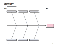
Printable Fishbone Diagram / Cause and Effect Diagram
The following cause and effect worksheets are PDF files that you can download and print from instantly.
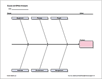
Fishbone Diagram Template
for Excel and OpenOffice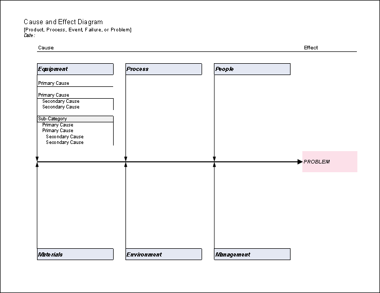
Download
⤓ Excel (.xlsx)Other Versions
License: Private Use (not for distribution or resale)
"No installation, no macros - just a simple spreadsheet" - by Jon Wittwer
Description
Create a cause and effect diagram with a spreadsheet. Although not angled like most fishbone diagrams, this template is very simple to edit and customize (as opposed to constantly moving and aligning text boxes and arrows).
- Use cell formatting to add/remove branches to the diagram.
- Insert rows to increase space for primary causes.
- Use text indenting within a cell for secondary or tertiary causes
- Copy and paste columns to insert more categories.
The Outline worksheet included in the workbook (screenshot not shown) is even simpler to use. It organizes the diagram into an outline view that is much easier to edit on the fly.
Using a Cause and Effect Diagram
The purpose of a cause and effect analysis is to identify the causes, factors, or sources of variation that lead to a specific event, result, or defect in a product or process. A fishbone diagram is simply a tool to be used along with Brainstorming and the 5 Whys.
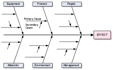
The various causes are grouped into categories and the arrows in the image below indicate how the causes cascade or flow toward the end effect. Due to its simplicity, the diagram is often drawn on a white board during a brainstorm session. I designed the above template so that it would easy for someone familiar with Excel to use during a meeting to record the ideas as they are discussed.
Steps to Using a Cause and Effect Diagram
- Define the Effect: Be specific.
- Choose Categories: The template is set up with the most common set of categories, but you can add or remove categories based on your specific case. See the example categories below.
- Brainstorm Possible Causes: Using the diagram while brainstorming can both broaden and focus your thinking as you consider the various categories in turn.
- Ask Why?: You really want to find the root causes, and one way to help do that is to use the 5 Whys technique: asking "Why?" or "Why else?" over and over until you come up with possible root causes. "Improper handling" is not a root cause, while "Failing to wear Latex gloves" might be closer to a root cause. But, you could still ask "Why was he/she not wearing gloves?" with the possible response "There were none available." It is a lot easier to take action against the inventory problem than just the generic "improper handling".
- Investigate: Now that you've come up with possible causes, it is time to go gather data to confirm which causes are real or not.
Common Categories in a Fishbone Diagram
| The M's | The P's (Service Industry) | The S's (Service Industry) |
|---|---|---|
| Machine (Equipment) Method (Process) Man Power (People / physical labor) Material Mother Nature (Environment) Management (Policies) Measurement (Inspection) Maintenance Marketing (Promotion) |
Plant/Place Process People Policies Procedures Price Promotion Product |
Surroundings Supplies Systems Skills |
Categorization vs. Causality
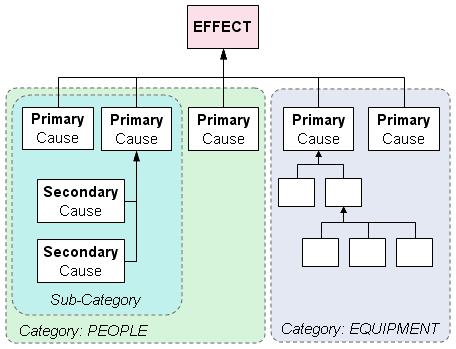
During a brainstorm session, this diagram is usually used very loosely, meaning that sometimes branches (what I have labeled as primary and secondary causes in the diagram below) may actually represent sub-categories of causes rather than actual causality.
When a cause and effect diagram is used to represent causality, then the primary and secondary branches taken on very specific meanings:
A Primary Cause is one that could lead directly to the effect. For example, a light bulb that burns out pre-maturely (the effect) might be caused by a sudden jarring motion such as dropping, which might be listed under the category People if it was associated with handling by a person (as opposed to machine handling).
A Secondary Cause is a cause that could lead to a Primary Cause, but does not directly cause the end effect. For example, the cause slippery hands doesn't make the bulb burn out, but it could lead to the light bulb being dropped. So slippery hands would be listed as a secondary cause under dropping.
When a fishbone diagram is used for simply categorizing possible causes, then instead of listing Dropping in the place of a primary cause, it might be listed under the sub-category Improper Handling, with Dropping and Throwing as different causes that fit under that sub-category. The following example shows the sub-categories highlighted.
| Causality Approach | Categorization Approach | Combination |
|---|---|---|
|
People
> Dropping > > Slippery Hands > > Rolling off a Table > Throwing |
People
> Improper Handling > > Dropping > > Throwing |
People
> Improper Handling > > Dropping > > > Slippery Hands > > > Rolling off a Table > > Throwing |
A tree diagram, probability tree, or root cause analysis is geared more towards thinking in terms of causality, while using a fishbone diagram tends to make people think in terms of categorization. Using the fish bone diagram loosely may result in a combination of the two approaches as the group oscillates between categorizing different causes and asking "Why?" or "Why else?".
Although I've never seen any reference for this technique, I use the following rule to distinguish between categorization vs. causality:
Just as the main categories (Equipment, People, etc.) are highlighted by placing a circle or box around them, if you include sub-categories in your cause-and-effect diagram, circle the sub-category so you can distinguish between categorization vs. causality.
The following tree diagram shows the difference between categorization (grouping of causes) and causality (the tree).
More Quality Management Resources
- Control Chart - by Vertex42.com - Easily create an Xbar-R control chart for a process.
- Pareto Chart - by Vertex42.com - Perform a pareto analysis (visualize the ranking of most significant factors)
