Control Chart Template
Although there are many Statistical Process Control (SPC) software tools available, many engineers (and dare I say statisticians?) still often create control charts in Excel. The Control Chart Template on this page is designed as an educational tool to help you see what equations are involved in setting control limits for a basic Shewhart control chart, specifically X-bar, R, and S Charts. See below for more information and references related to creating control charts.
Control Chart Template
for Excel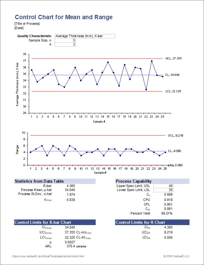
Download
⤓ Excel (.xlsx)Other Versions
License: Private Use (not for distribution or resale)
"No installation, no macros - just a simple spreadsheet" - by Jon Wittwer
Description
This template contains a pre-made control chart for sample Mean and Range, or sample Mean and Standard Deviation (2 worksheets in one). Just add your own data. Control limits are calculated based on the data you enter.
- Evaluate process capability (Cp, CPU, CPL, Cpk, and % Yield) for given specification limits.
Note: In the X-bar & R control chart, the number of observations per sample (n) can be between 2 and 25. In the X-bar & S chart, n must be greater than 4.
Creating a Control Chart
The Control Chart Template above works for the most common types of control charts: the X-Bar chart (plotting the mean of a sample over time), the R chart (plotting the range or Max-Min of a sample over time), and the s chart (plotting the sample standard deviation over time).
I created these control charts based on the terminology used in reference [1] below. Reference [2] is a great online resource that explains the formulas and steps for creating these control charts.
I know I'm eventually going to get asked about how the values for d2 and d3 are calculated for the X-bar and R charts. These factors are the mean and standard deviation of the statistic W = R/s, respectively and can be found tabulated in most text books or references about control charts. W is commonly referred to as the relative range or studentized range and is used to estimate the process standard deviation when only the sample mean and range are known. After trying to read through reference [3], I decided not to try the numerical integration of the range distribution within Excel, so I just hard-coded the values for the factors into an array. This is why the X-bar chart is limited to sample sizes of 2 to 25. The hardest part of creating the s-chart is calculating the c4 factor. This requires the use of the Gamma function for calculating factorials of half-integer numbers (see this blog post).
Other Templates related to Control Charts
- Pareto Chart - This template helps you perform a pareto analysis to analyze most significant factors.
- Box and Whisker Plot - Create a box plot in Excel for multiple data sets.
- Dot Plot - How to create a simple dot plot in a spreadsheet without a chart object.
Control Chart Resources
- [1] A. Mitra, Fundamentals of Quality Control and Improvement, 2nd ed., Prentice Hall: New Jersey, 1998.
- [2] Calculating Control Limits at www.itl.nist.gov - Gives equations and control chart factor tables for calculating control limits for X-bar, S, and R charts.
- [3] E. S. Pearson, "The Percentage Limits for the Distribution of Range in Samples from a Normal Population. (n<=100.)", Biometrika, 1932, 24 (3-4), p. 404
