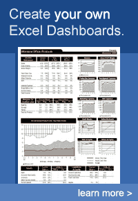
Create Excel Dashboards
Excel dashboards have become a popular way to create concise and professional reports. Excel is actually one of the best tools for summarizing data in charts and tables, and creating interactive financial models. However, creating a good Excel dashboard is something that few people are able to do without some training.
The value of data depends upon the ability to access it, analyze it, interpret it, and communicate it. When you can make vital information accessible to the people who need it to make decisions, in a way that is easily and correctly communicated, you become a valuable asset to your company.
Randy Austin has a great online class on his website ExcelForFreelancers.com that teaches a lot of amazing dashboard reporting techniques (over 15 hours material).
The ebook, "Dashboard Reporting With Excel," by Charley Kid of ExcelUser.com made it much easier to create dashboards in Excel. The images below come from ExcelUser.com, the home of the original Excel Dashboard Kit. The kit included a 200 page ebook, example workbooks, and a bunch of other stuff.
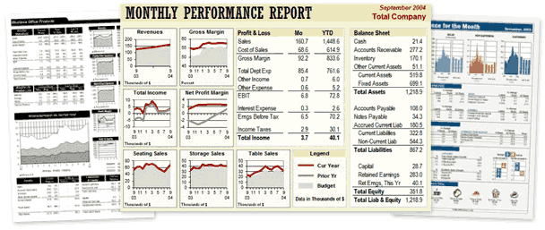
The examples at ExcelUser.com show that it is possible to make professional summary reports using Excel. For more information, check out the Excel Dashboards section of the ExcelUser.com blog.
Dashboard Report Tips
Clearly the easiest way to create a good Excel dashboard is to start from a template already created, like those shown above. But if you want to start from scratch, here are a few tips I've learned along the way.
- Get Rid of the Grid - After laying out your spreadsheet the way you want it, turn off the grid or cell outlines to make your spreadsheet look cleaner.
- Chop Down the Charts - Do you really need a half sheet of paper to show a single line or bar graph? Make your charts smaller. Just be careful to not make the text too small to read. The tricks that Charley Kyd describes in his Dashboard Kit to optimize chart size are spot on. You could also try using sparklines if that makes sense for your data.
- Go Easy on the Eyes - Unless you are graphic designer or have an innate sense for color schemes, it may be best to stick with monochromatic colors
 in your dashboard layout (especially cell background colors). This is easy in Excel 2007 with the new palette. But, if you are trying to create your own monochromatic color scheme, pick your base color, and then make the other colors have different lightness or luminance (the L value in the HSL mode).
References
- Excel Dashboards," by Charley Kyd, October, 2004. http://www.exceluser.com/dash/startdash.htm