Graphing a Normal Distribution Curve in Excel
After creating histograms, it is common to try to fit various distributions to the data. The most common is the Normal distribution, which is completely defined by the mean and standard deviation. (See summary statistics for calculating the mean and standard deviation in Excel).
There is more to distribution fitting than just overlaying a distribution on top of the histogram. However, this page came about because I have often been asked specifically how to create a Normal distribution curve in Excel.
There are many ways to create the graph, using line charts, bar charts, area charts, and scatter plots. Some of the tricks for creating the charts (such as using thick error bars to create the area shading effect on scatter plots) are found in my article "Creating a Histogram in Excel". Also, you will need to scale the histogram before overlaying the distribution.
Normal Distribution Chart Template
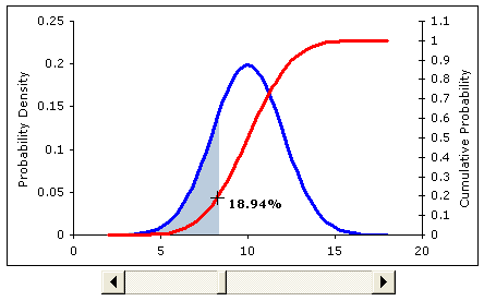
Screenshot from the excel file. In the spreadsheet, the slider bar below
the chart will move the shaded region (the cumulative probability).
Instead of following a detailed tutorial, please just go ahead and download the example Excel file. The file does not contain any macros. If you have questions about what a Normal distribution is, please see the reference below.
Download Now (.xls)
In addition to graphing the Normal distribution curve, the normal distribution spreadsheet includes examples of the following:
- Generating a random number from a Normal distribution.
- Calculating cumulative probabilities.
- Shading a portion of the distribution (see below).
The graph shown in the screen-shot above is particularly useful for showing the relationship between the probability density function and the cumulative probability. Both the label and the shaded region change after you move the slider.
REFERENCES:
Eric W. Weisstein. "Normal Distribution." From MathWorld--A Wolfram Web Resource. https://mathworld.wolfram.com/NormalDistribution.html
